In 2012, Kentucky implemented Medicaid managed care statewide, auto-assigned enrollees to three plans, and allowed switching. Using administrative data, we find that the state’s auto-assignment algorithm most heavily weighted cost-minimization and plan balancing, and placed little weight on the quality of the enrollee-plan match. Immobility—apparently driven by health plan inertia—contributed to the success of the cost-minimization strategy, as more than half of enrollees auto-assigned to even the lowest quality plans did not opt-out. High-cost enrollees were more likely to opt-out of their auto-assigned plan, creating adverse selection. The plan with arguably the highest quality incurred the largest initial profit margin reduction due to adverse selection prior to risk adjustment, as it attracted a disproportionate share of high-cost enrollees. The presence of such selection, caused by differential degrees of mobility, raises concerns about the long-run viability of the Medicaid managed care market without such risk adjustment.
James Marton, Aaron Yelowitz, and Jeffery C. Talbert. “Medicaid program choice, inertia and adverse selection.” Journal of Health Economics 56 (2017): 292–316. https://doi.org/10.1016/j.jhealeco.2017.04.006
Authors: James Marton, Aaron Yelowitz, and Jeffery C. Talbert Citation: James Marton, Aaron Yelowitz, and Jeffery C. Talbert (2017). Medicaid program choice, inertia and adverse selection. Journal of Health Economics 56: 292–316. DOI: 10.1016/j.jhealeco.2017.04.006.
Received 30 September 2016; received in revised form 17 April 2017; accepted 28 April 2017.
In 2012, Kentucky implemented Medicaid managed care statewide, auto-assigned enrollees to three plans, and allowed switching. Using administrative data, we find that the state’s auto-assignment algorithm most heavily weighted cost-minimization and plan balancing, and placed little weight on the quality of the enrollee-plan match. Immobility—apparently driven by health plan inertia—contributed to the success of the cost-minimization strategy, as more than half of enrollees auto-assigned to even the lowest quality plans did not opt-out. High-cost enrollees were more likely to opt-out of their auto-assigned plan, creating adverse selection. The plan with arguably the highest quality incurred the largest initial profit margin reduction due to adverse selection prior to risk adjustment, as it attracted a disproportionate share of high-cost enrollees. The presence of such selection, caused by differential degrees of mobility, raises concerns about the long-run viability of the Medicaid managed care market without such risk adjustment.
Keywords: Medicaid; Managed care; Inertia; Adverse selection JEL classification: D82; G22; I13; I18 Acknowledgments: We would like to thank Tim Harris, Makayla Palmer, Minji Sohn, and Jaesang Sung for their research assistance. We would also like to thank David Agrawal, Amy Burke, Julia Costich, Embry Howell, Inas Rashad Kelly, Jenny Kenney, Ashley Palmer, Ben Ukert, Laura Wherry, the staff of the Foundation of Healthy Kentucky, the staff of the University of Kentucky Institute for Pharmaceutical Outcomes & Policy, and seminar participants at the University of Kentucky, University of Louisville, the Association for Public Policy Analysis and Management, the American Society of Health Economists, and the Southern Economic Association for their helpful advice and assistance. We are also grateful for comments from the referees and editor. Any errors are, of course, our own.
Affiliations: James Marton — Georgia State University, Georgia State University, Department of Economics, P.O. Box 3992, Atlanta, GA, United States. Aaron Yelowitz — University of Kentucky, Department of Economics, 223B Gatton Business and Economics Building, Lexington, KY, United States. Jeffery C. Talbert — University of Kentucky, College of Pharmacy, 789 South Limestone St., Lexington, KY, United States.
Between 2002 and 2014, the share of the Medicaid population enrolled in managed care grew from 58 percent to 77 percent (CMS, 2011; Mathematica Policy Research, 2016). By 2014, 61 percent of the 71.7 million Medicaid recipients nationwide were enrolled in comprehensive managed care plans, a sharp increase from the 56 percent just one year earlier (Mathematica Policy Research, 2015, 2016). As of July 2015, 48 states use managed care for at least some Medicaid recipients, 39 states contract with managed care organizations (MCOs), and 29 of them (including DC) use MCOs exclusively (Smith et al., 2015).
In many instances, consumers in a health insurance market face many choices between different plans. Even with a fully-binding individual mandate that compels health insurance coverage, offering choice between different health insurance plans during open enrollment periods − either through Medicaid MCOs, Qualified Health Plans (QHPs) in the Marketplace, in Medicare Part D, or elsewhere − raises the possibility of adverse selection and consequently economic losses for insurers. This has been seen recently in private Marketplace plans with major insurers − UnitedHealth Group, Humana Inc., and most recently Aetna − withdrawing completely, scaling back, or cancelling expansions, citing large losses on Marketplace plans (Matthews, 2016). Such adverse selection “death spirals” have been demonstrated in some other health insurance contexts (Cutler and Reber, 1998).
Compared with either Marketplace QHPs or Medicare Part D, analysis of coverage choices in Medicaid MCOs allows us to investigate the consequences of inertia, adverse selection, and plan payment design on insurance market stability in a completely new setting. In QHPs, consumers typically face multiple bronze, silver, gold and platinum plans, with different subsidized premiums, copayments or coinsurance rates, deductibles, out-of-pocket maximums, and network coverage. Given this complexity, recent work has argued for personalized decision support and smart defaults (Handel and Kolstad, 2015b). In Medicare Part D − which only focuses on the prescription drug portion of the healthcare package for the elderly − recent work has noted that the financial complexity of the plans appears to lead to “choice inconsistencies” and little learning on the part of consumers (Abaluck and Gruber, 2011, 2016; Ketcham et al., 2012; Ketcham et al., 2015). In both contexts, the consumer must compare both financial implications (making a forecast of future distribution health care use) and benefit generosity across multiple plans. In contrast, the choice problem for Medicaid MCOs is simpler because the financial implications from different plans are minimal. Recipients with income under 150 percent of the FPL generally cannot be charged premiums for any plan. They also pay nominal amounts for drugs, and face more limited copayments for non-emergency use of emergency departments.1 Thus, with zero premiums and negligible out-of-pocket cost differences across plans, recipients should choose plans based on benefit quality in the absence of inertia.
Medicaid beneficiaries who are required to enroll in MCOs must be offered a choice of at least two plans, and those who do not select a plan are auto-enrolled in one. All but one of the 39 states with MCOs have an auto-enrollment process.2 The median state typically auto-enrolls 45 percent of new recipients, defaulting them into a particular MCO. Besides the universal goal of lowering program costs, states typically include factors such as past provider relationships, geographic location, and continuity with other family members into their auto-assignment process. In addition, 23 of the 38 states with auto-assignment attempt to balance enrollments among plans, while 15 states consider plan capacity. Only 8 states’ auto-assignment algorithms account for quality rankings. Auto-assignment, and the likelihood of at least
some degree of inertia from such defaults, has important implications for the impact of adverse selection on MCO profitability and, thus market stability. In economic terms, one can think of the state’s objective as choosing an auto-assignment strategy as one of several policy tools that strikes some balance between promoting the stability of the Medicaid managed care market (plan balancing) and matching enrollees with the highest quality plans while at the same time minimizing costs.
In this paper we examine the impact of auto-assignment and health plan inertia (i.e. the extent to which auto-assignment predicts enrollment) on adverse selection and the subsequent impact of selection and plan payment on the stability of the Medicaid managed care market in Kentucky, which introduced statewide Medicaid managed care in 2012.3 The state auto-assigned enrollees to one of three plans then established a 90-day open enrollment period in which enrollees could switch. Using rich administrative data on all Medicaid enrollees in Kentucky, we analyze the impact of the auto-assignment algorithm selected by the state and enrollee responses to auto-assignment during open enrollment on the state’s Medicaid budget, the quality of the match between enrollees and the plan in which
they ultimately enroll, and the profitability of the plans. Plan profitability is a key determinant of how well the market functions. Given this background, we attempt to answer the following specific questions: first, what weight does the
state’s auto-assignment algorithm give to the competing objectives of plan balancing, maximizing enrollee-plan match, and minimizing costs? Second, to what extent do individual enrollees remain in their auto-assigned plan? Third, do differential degrees of mobility, or lack thereof, lead to adverse selection? Finally, with the inertia from auto-assignment, does selection threaten the stability of the market both before and after risk adjusted plan payments are implemented?4
Our analysis produces several strong conclusions. First, we find evidence that the state’s auto-assignment algorithm most heavily weighted cost considerations (i.e. lower capitation rates) and plan balancing, and placed less weight on quality of the enrollee-plan match. That is, instead of producing a “smart individual default” by maximizing quality of care for enrollees, the algorithm largely attempted to minimize costs, in a sense producing a “smart societal default” (from the point of view of taxpayers). For example, our simulation suggests that the algorithm selected by the state saved them over $31 million annually (approximately $200 per enrollee) as compared to the “smart individual default” algorithm. Second, from the state’s perspective, the presence of inertia contributed to the success of their cost-minimization
strategy. Even in the lowest quality plans, more than half of auto-assigned enrollees did not opt-out, and the percentage was greater in the highest quality plans.5 Third, we observe a considerable degree of adverse selection, caused by lower levels of inertia among high cost enrollees. Although the share of enrollees that switched plans during open enrollment was small, the share of prior health care spending associated with those enrollees was large. Among individuals in the top 10 percent of the prior spending distribution, mobility across plans was dramatically higher regardless of initial plan assignment. Given that such high-cost individuals comprise nearly 50 percent of all prior spending, such movements have important implications for the financial stability of the three plans. Our simulations
suggest that the plan generally considered to be the highest quality incurred the largest initial reduction in profit margin due to adverse selection prior to risk adjustment, as it attracted a disproportionate share of high-cost enrollees during open enrollment. In addition, the plan considered to be lowest quality saw a large increase in profit margins, while a third plan lost money. The presence of such selection, caused by differential degrees of inertia between the healthy and the sick, raises concerns about the long run viability of the Medicaid managed care market in this context. The inertia from auto-assignment alone was clearly insufficient to ensure market stability. The state attempted to address these stability concerns with a subsequent round of budget-neutral
risk adjustment to the capitation rates. Our simulations show risk adjustment did improve stability, as profits were non-negative for all three plans afterwards.
The rest of the paper is arranged as follows: Section 2 reviews the literature on inertia, with a focus on insurance markets, then Section 3 provides an institutional background on the transition to statewide Medicaid managed care in Kentucky. Section 4 presents an economic model of the choices faced by enrollees, the state, and the MCOs. Section 5 lays out our empirical strategy and Section 6 describes the administrative data we use to implement this strategy. Our results, including a series of policy simulations, are presented in Section 7. Section 8 discusses auto-assignment strategies and welfare implications, and Section 9 concludes the paper.
2. Literature review
There is an established inertia literature with studies on retirement plans (Madrian and Shea, 2001; Choi et al., 2002, 2004; Chetty et al., 2014; Messacar, 2014), organ donation (Johnson and Goldstein, 2003; Abadie and Gay, 2006), life insurance (Harris and Yelowitz, 2017), and income tax refunds (Jones, 2012). More closely related to this study, there has been evidence of inertia in health insurance decisions including Medicare Part D (Ketcham et al., 2012; Ericson, 2014; Ho et al., 2015; Ketcham et al., 2015; Polyakova, 2016), and private health insurance (Handel, 2013; Handel and Kolstad, 2015a; Dahl and Forbes, 2016). Although studies of inertia are widespread, there is significant diversity in magnitudes depending on the situation. The degree of inertia has been found to depend on budget share and salience of the product. For example, in the case
of employer-sponsored health insurance (significant budget share and relatively salient), Dahl and Forbes (2016) found that 22 percent of employees were inert (with an even smaller share in subsequent years), whereas in the case of employer-sponsored life insurance (small budget share) there was almost 100 percent inertia (Harris and Yelowitz, 2017). Even though these cases illustrate some patterns in inertia, the degree of inertia for Medicaid plan choice where the budget share is virtually zero remains unknown. In addition to the variation in magnitudes, there is also variation by market environment. In the context of Medicare Part D, Ketcham et al. (2012) show that those that were losing the most financially were less inert. Similarly, Dahl and Forbes (2016) find in the context of employer-sponsored health
insurance that individuals with higher expected costs exhibited less inertia and were more likely to switch plans. In the case of mortgage refinancing, Andersen et al. (2015) find that more educated and higher-earning individuals have less inertia and less inattention. These differences can have important implications for adverse selection in insurance markets inasmuch as inertia is correlated with expected cost. Strombom et al. (2002) analyze employer-sponsored health insurance for a large multi-location employer and find that younger, recently hired employees are more likely to respond to premium increases whereas older, incumbent employees in worse health are the least likely to switch leading to what they call “adverse retention.”6 Additionally, Polyakova (2016) finds, in the context of Medicare Part D, that high
frictions leading to inertia allow for an adversely-selected equilibrium that would otherwise lead to unraveling of the market. In yet another study, Handel (2013) analyzed the effects of a policy change that caused individuals to make an active choice regarding employer-sponsored health insurance. He finds that in the absence of inertia individuals made improved decisions. These improved decisions led to a greater degree of adverse selection. Although Handel (2013) finds a negative relationship between inertia and adverse selection the study highlights that the reverse could be true in a different
market environment and that the relationship can have potentially surprising welfare implications. Given the Medicaid expansions under the Affordable Care Act and the widespread implementation of auto-enrollment/assignment, both the inertia and its interaction with adverse selection are relevant for policy makers. Handel and Kolstad (2015b) illustrate how policy makers can use “smart defaults” to increase consumer welfare given that individuals exhibit inertia. At the same time, policy makers may use inertia to reduce overall costs. To our knowledge, ours is the first study to analyze inertia in Medicaid managed care from auto-assignment.
3. Institutional background
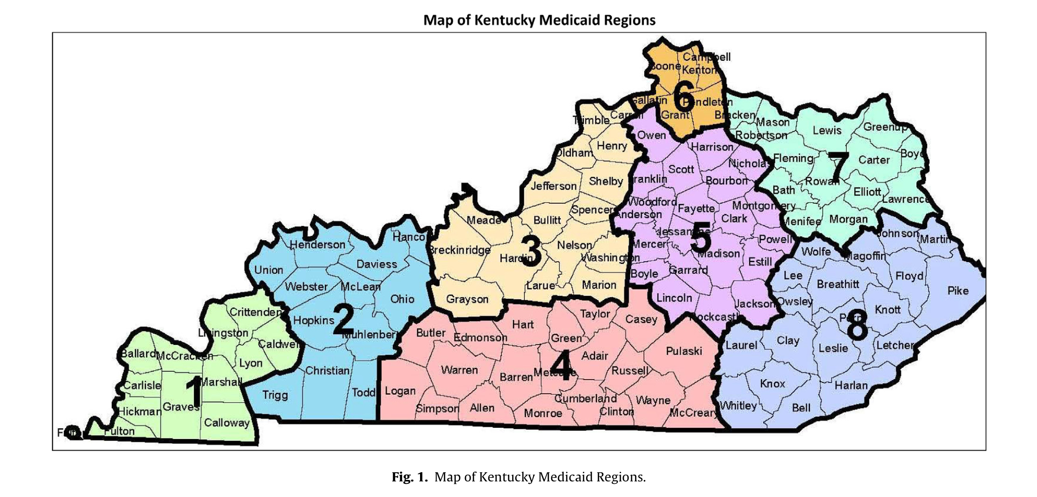
The introduction of the Passport Health Plan (Passport) in November 1997 marked Kentucky Medicaid’s first major attempt to transition its enrollees into managed care coverage. Passport is a local non-profit MCO anchored by the University of Louisville hospital network. All Medicaid enrollees that live in the Louisville area (Region 3 in Fig. 1) were required to enroll in Passport.78 No further attempt was made to expand Medicaid managed care (MMC) outside of Region 3 until 2011, when a very aggressive timeline was implemented for such an expansion. As described in Palmer et al. (2012), in April 2011 Kentucky sought bids from MCOs to cover Medicaid enrollees outside of Region 3. Kentucky’s Request for Proposals (RFP) scored the MCO bids based on “Provider Network Evaluation”, “Oral Presentations/Demonstrations”, “Cost
Proposal Evaluation” and “Technical Proposal Evaluation.” It did not explicitly explain how many providers the state would choose, simply stating that: “Through this RFP, the Commonwealth seeks to contract with multiple MCOs in each of the Medicaid Managed Care Regions that deliver the highest quality health care services to Kentucky Medicaid Members at the most favorable, competitive prices.” Federal law, along with the RFP’s “multiple MCOs”, would lead bidders to believe there would be at least two awardees. The RFP also noted a vendor’s conference held in Frankfort, KY in May 2011 (before proposals were due). Each potential bidder was likely to attend this conference, and would be aware that there were many potential bidders. In May 2011, Kentucky received bids from
seven MCOs and selected three based on their likely performance and cost in July 2011: Coventry Cares of Kentucky (Coventry), WellCare of Kentucky (Wellcare), and Kentucky Spirit (Spirit).9 Given the emphasis on reducing costs highlighted throughout the RFP, along with Kentucky being opaque about how many MCOs they would choose, we suspect that bidders would probably feel pressure to submit lower bids, potentially leading to the sorts of adverse selection problems highlighted in our analysis.
Each plan negotiated regional capitation rates for a uniform set of demographic categories, which we refer to as capitation categories. To better understand how Kentucky’s plan payment system worked, we draw from Kentucky’s initial RFP to MCOs, the final signed contracts with the three selected MCOs, and a first-year implementation report produced by Urban Institute (Palmer et al., 2012).10 The RFP (issued in April 2011) would have been used by bidders to form expectations about capitation rates and adjustments. The RFP discusses risk adjustments for MCOs—payments were to be adjusted using “information on member’s medical conditions, as reported in claim and encounter data to predict prospective or concurrent health care costs and adjust payments to MCOs.” The final contracts for MCOs stated risk adjustment would use the Chronic Illness and Disability Payment System (CDPS) Rx model and would be budget-neutral, with the state and its actuaries deciding on risk adjustment when the MCOs could not collectively agree.11 Kentucky started using the CDPS-Rx model for these MCOs in April 2012 (Palmer et al., 2012).
Although it is difficult to document the precise capitation and risk adjustment mechanism from 2011/2012 (due to lack of documentation), it is possible to document how Kentucky Medicaid MCOs operate more recently, based on a 2015 “Data Book” published by Aon Hewitt (2015).12 First, the process of creating capitation categories is identical to 2011. The RFP from 2011 requests rates based on category, age, and gender. There are 5 “ratings groups” (families and children; SSI adults without Medicare; dual eligibles; SSI children; and foster care), which are ultimately broken out into “rate cells” based age and gender. In addition, capitation rates are constructed for each of these rate cells in the 8 regions “to reflect regional differences in claim costs, access and managed care in the State
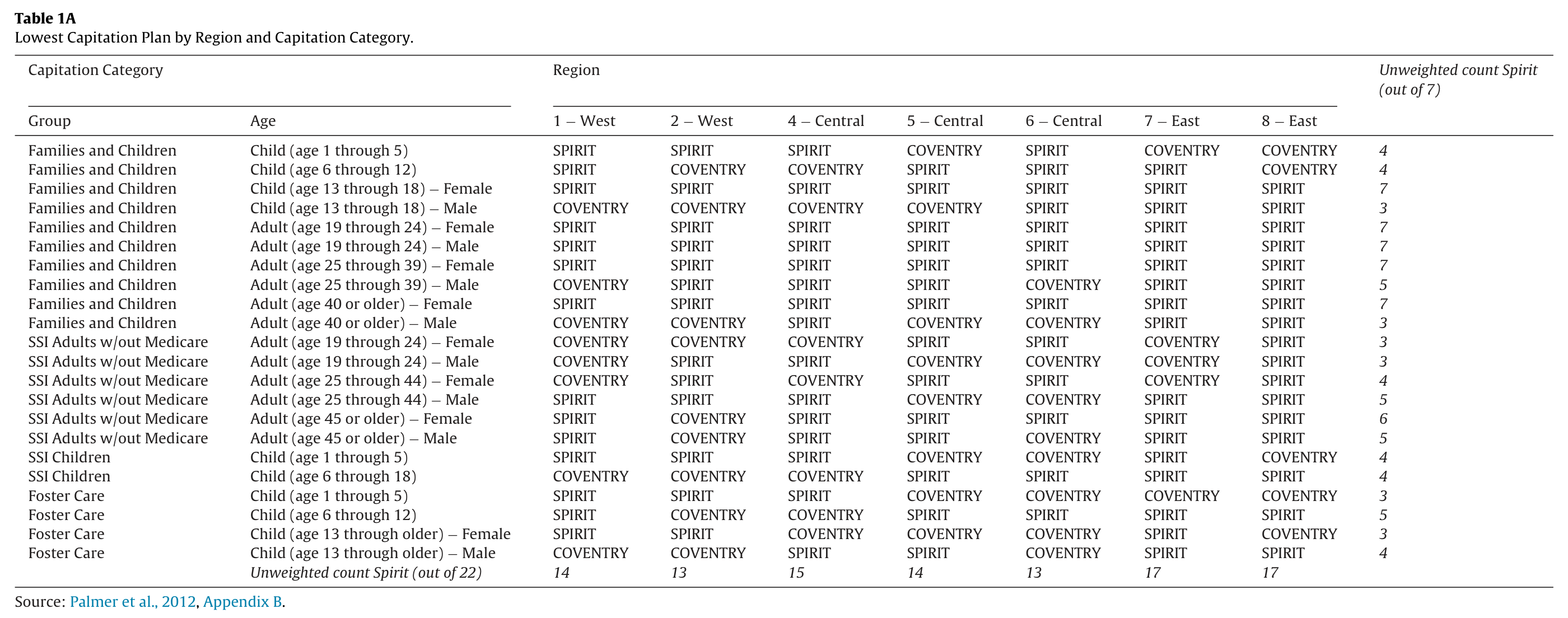
of Kentucky.” Second, the 2015 “Data Book” discusses risk adjustment. Risk scores are assigned to each individual based on the CDPS + Rx model, using ICD-9 codes to assess risk. The model is concurrent, in that the risk profile of the MCO enrollees is based on the same year of data (rather than previous year’s enrollees).13 Risk scores are aggregated by demographic cell, region, and attributed MCO, and relative risk adjustment scores are calculated. Thus, based on the mix of risk across the MCOs for each of the demographic cells x regions, capitation payments are adjusted across the MCOs in a budget neutral manner. In general, the highest capitation rates were negotiated by Wellcare and the lowest by Spirit. Table 1A lists the MCO with the lowest capitation rate for each demographic-region bin. We see that Wellcare
was never the lowest rate plan in any bin, Spirit was the lowest rate plan more often than Coventry across all regions, and that this was especially true in eastern Kentucky (Regions 7 and 8). In November 2011, the state auto-assigned enrollees outside of Region 3 to either Wellcare, Coventry, or Spirit, then established a 90 day open enrollment period during which enrollees could switch plans.14 According to Palmer et al. (2012), the state assigned more enrollees to plans with lower capitation rates, with Spirit receiving an initial assignment of over 200,000 members out of an approximate total of 550,000. Although we cannot directly observe the weights put on various factors, Palmer et al. (2012) provide the following qualitative description of Kentucky’s auto-assignment algorithm:
“The auto-assignment algorithm accounted for the enrollees’ historical physician relationships, consistency of household members assigned to the same plan, and load balancing across plans. When this was taken into account, preference was given to the plan with the lowest premium.”15
Table 1A. Lowest Capitation Plan by Region and Capitation Category
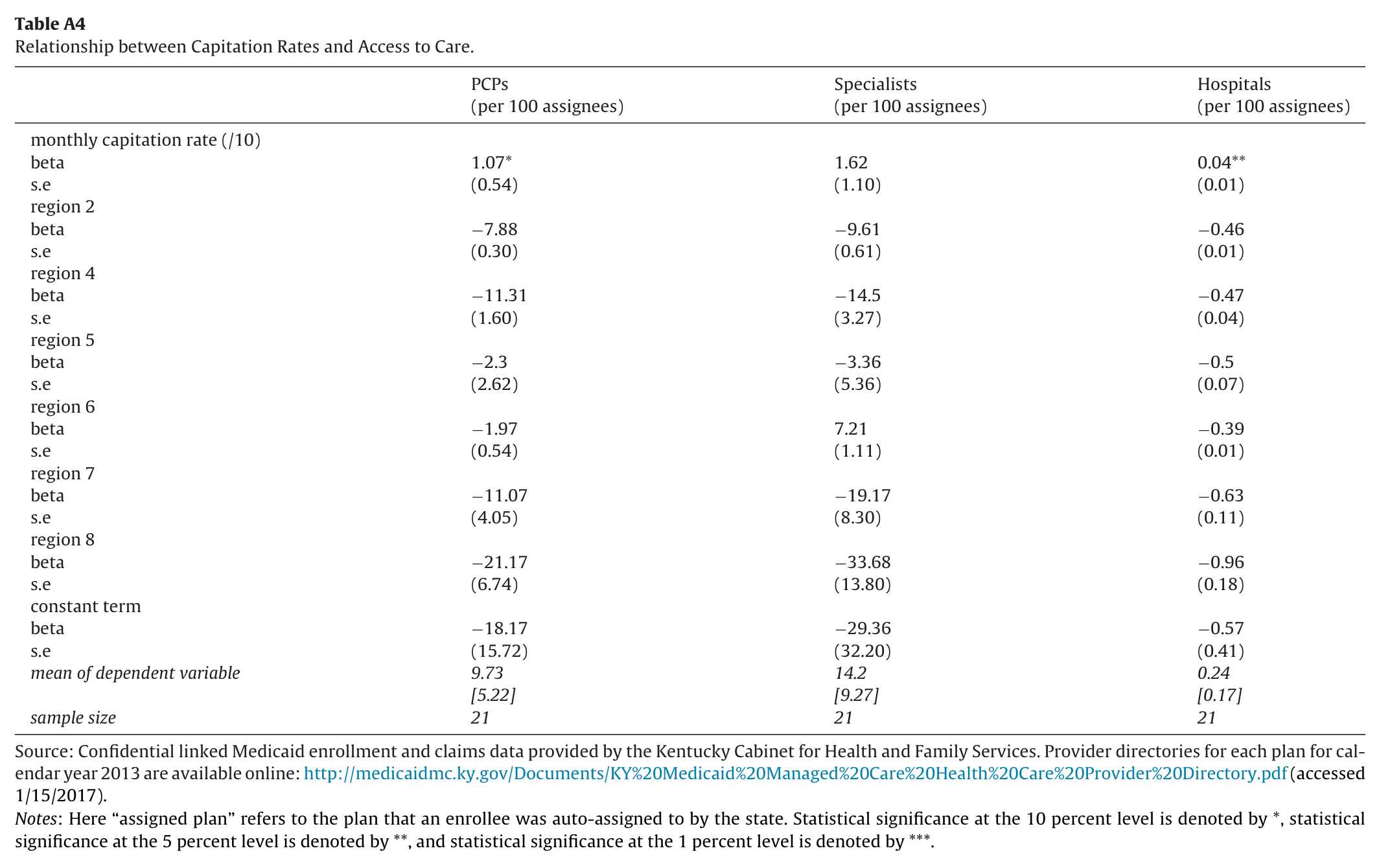
In the next section of the paper we discuss in more detail the varying objectives a state might have in the construction of such an algorithm. There were many similarities and some differences between the three plans. In terms of cost, there were no premiums associated with any of the plans, as is typically the case in state Medicaid program. This shifts the focus more squarely to differences in MCO quality. In general, the plans offered a uniform set of services and did not “carve out” services such as behavioral health, dental, and pharmaceuticals. To the extent to which differences in capitation rates reflect differences in quality, we would regard Wellcare as generally being the highest quality plan and Spirit
the worst. That being said, Table 1A illustrates that Spirit was not the lowest cost plan in every demographic-region bin and it is also the case that Wellcare was not the highest cost plan in every bin. Differences in MCO success in contracting with local providers both by MCOs and region would lead to differences in quality via access-to-care. As described in detail in Palmer et al. (2012), as of June 2012, 73 percent of hospitals in the state contracted with all three MCOs, 25 percent contracted with two MCOs, and 2 percent only contracted with one plan.16 This report also states that subsequent actions by the MCOs with respect to their provider networks suggests that these numbers likely overstate the extent of actual overlap
in the hospital networks across the three MCOs. Physician practices tended to participate in plans that their local hospital contracted with. One notable regional difference is that Spirit was not able to contract with Appalachian Regional Healthcare, a dominant provider in eastern Kentucky due to unsuccessful rate negotiations. Thus the quality of the Spirit plan could be viewed as lower than other MCOs in eastern Kentucky because enrollees would have trouble receiving services from the region’s dominant provider. Spirit’s difficulties in eastern Kentucky were widely reported in the press, so we would expect there to be greater awareness of differences in MCO provider network quality in that region, as compared to the rest of the state.17
4. An economic model of insurance choice
Here we describe an economic model of insurance choice that borrows heavily from choice models presented in Handel (2013) and Handel and Kolstad (2015a), two papers that examine the employer-provided health insurance market. Like an employer, in our context the state/taxpayers serve as an intermediary between insurance providers/managed care organizations (MCOs) and those being covered (employees/Medicaid recipients). As mentioned in the previous section, the state contracted with MCOs and assigned enrollees to one of the three plans (Wellcare, Coventry, or Spirit) at time t-1, then enrollees had a 90-day open enrollment period denoted by time t in which they could opt-out of their assigned plan and enroll in another. We work backwards through the choices faced by each
agent.
4.1. Medicaid enrollee choice of MCO
We assume Medicaid recipients are one of two health types denoted generically by . Relatively healthy, low-cost enrollees are represented by and relatively sick, high-cost enrollees are represented by . In addition, we assume recipients can also be partitioned into two mobility types denoted generically by , where denotes inert individuals and denotes mobile individuals.18 We can therefore express the total of N Medicaid enrollees as the sum of four groups:
Following Handel (2013) and Handel and Kolstad (2015a), we assume consumers have a constant absolute risk aversion (CARA) utility function defined over state-contingent consumption:
Here enrollees are indexed by i, health plans are indexed by p, and time by t. Individual wealth is denoted by , the premium charged to enrollee i for plan p at time t is denoted by , and the out-of-pocket medical expenses incurred is denoted by . Inertia is modeled generally as in Handel (2013) as a tangible switching cost, denoted by , that is a function of individual characteristics . The variable indicates that enrollee i was auto-assigned to plan p at time t-1. Thus, consumption is higher by if the enrollee remains in their auto-assigned plan. As in Handel and Kolstad (2015a), we model the non-financial attributes of plan p, such as differences in provider
networks leading to differential time and hassle costs of scheduling appointments or dealing with prior authorization requirements, as a plan-specific shifter denoted by .19 It is a function of plan design, denoted by , and enrollee health status (). Finally, is an error term.
Unlike the setting of employer-provided health insurance, in our setting of Medicaid managed care plans, for any enrollee in any plan. Thus state-contingent consumption in our context is given by:
In the absence of inertia, all individuals at time t would move to the highest quality plan being offered if they were not initially auto-assigned to that plan at time t-1. With frictions that create differences between decision utility and true utility − some will not opt out of an auto-assignment to a lower quality plan, but the structural framework would allow us to estimate all relevant parameters.20
4.2. State choice of auto-assignment
Given the demographic-region bin capitation rates negotiated with each MCO, perhaps some thoughts about how enrollees might respond, and a budget for Medicaid programmatic expenditures imposed by taxpayers, the state must decide how to auto-assign enrollees across plans. Smith et al. (2015) provides a nice description of potential considerations that may factor into such a decision: “States’ auto-enrollment algorithms also vary, but are usually designed to take into consideration previous plan or provider relationships, geographic location of the beneficiary, and/or plan enrollments of other family members. In addition, over half (23) of MCO states reported that their auto-enrollment algorithms were designed to balance enrollments among plans; 15 states considered plan capacity, and eight states took plan quality rankings into consideration. Other states
noted plans to move toward including quality rankings in their auto-assignment algorithms in the future.” We broadly think of these considerations as relating to “initial plan balance” or “match-specific quality.” In economic terms, one can think of the state’s objective as choosing an auto-assignment strategy that strikes some balance between promoting the stability of the Medicaid managed care market (plan balancing or providing a critical mass) and matching enrollees with the highest quality plans while at the same time minimizing costs/adhering to their taxpayer imposed budget. All else equal, we would also expect that the state would prefer to pursue a “cost-minimization” strategy and assign enrollees to lower cost plans.
4.3. MCO capitation rate negotiation with the state
The first step in this entire process is the establishing of a contract between the state and the MCOs. Obviously, the MCOs are private firms seeking to maximize profits, so would prefer higher capitation rates than the cost-minimizing state would prefer. Capitation rates are negotiated for a uniform set of demographic categories separately by region, as described in the previous section. MCOs may build into their capitation rate bids their expectations about the number of other bidders, the auto-assignment process the state may choose, the subsequent risk pool generated by the assignment process, and any further risk adjustment post-enrollment.21 The risk adjustment mechanism employed by the state deserves further elaboration. Although the state did not explicitly commit to auto-assignment rules
or the number of MCOs it would choose, it did repeatedly emphasize the importance of reducing total costs and did explicitly recognize the potential role for adverse selection during the open enrollment period. Further, the state pre-committed to risk-adjusting capitation rates after open enrollment. Thus, it would be reasonable for MCOs to assume − as in fact occurred − that MCOs would be assigned a greater share of enrollees in return for relatively low capitation rate bids, and that the state would stabilize the insurance market ex-post by adjusting capitation rates based on mobility and the distribution of health risk.22 Such risk adjustment largely eliminates issues of MCO losses due to adverse selection, at the expense of increasing costs to the state/taxpayers. At the same time as negotiating over rates, the MCOs also negotiated with the state over quality related plan characteristics, such as provider network size. This, in turn, required each MCO to negotiate contracts with individual providers in each part of the state.23 Overall, competition in the MCO market dictates the number of other bidders and thus how much leverage each MCO brings to the negotiation. Federal regulations require states to offer Medicaid enrollees in managed care the choice between at least two plans.
5. Methods and identification strategy
We estimate models examining inertia from auto-assignment in the first year of open enrollment, and how differential degrees of inertia lead to adverse selection. We estimate linear probability models estimating inertia of the form:
where is an indicator for whether individual i in region r ultimately enrolled in plan p and indicates whether that individual was initially assigned to that plan. As discussed, there are three plans (Wellcare, Coventry, and Spirit) that an individual could have been assigned to. The vector includes 22 demographic categories on which capitation rates were based (combinations of age, gender, and eligibility category), as well as an indicator for non-white, while are dummy variables for regions within Kentucky (all regions depicted in Fig. 1 except Region 3). Although the data on individuals is gathered from different points in time (i.e. enrollment is as of March 2012, while assignment is as of November 2011), the regressions should be thought of
as crosssectional analyses, so no time subscripts are included. Standard errors are heteroscedasticity-robust.
Under certain assumptions, discussed extensively below, the estimated coefficient can be interpreted as inertia. That is, if initial assignment into plan p raises the likelihood of ultimately enrolling in that plan, then the defaults generated from auto-assignment affect actual behavior. We expect , which is interpreted as initial assignment increasing the likelihood of ultimately enrolling in the plan.
As importantly, we investigate whether individual characteristics − such as high medical expenses − affect the degree of inertia. In such specifications we estimate models of the form:
where the specification is similar to before, and is an indicator for whether individual i is classified as having “high” expected medical expenses relative to others in their auto-assigned demographic bin (i.e. type ), which is useful for determining
adverse selection. In practice, we separate individuals based on their lagged actual medical expenses, where we create indicators for expenses in the 99th percentile or above, 95th to 99th percentile, 90th to 95th percentile, and 75th to 90th percentile (with the omitted category being “healthy” individuals with relatively modest expenses under the 75th percentile − type ) within the enrollee’s auto-assigned demographic bin. Under the plausible assumption that the benefits of choosing the most appropriate plan is higher for unhealthy individuals (and the costs are the same), we would expect less inertia for high-cost individuals. Thus, one would expect the estimated interaction term , since initial assignment is less “sticky” for high-cost enrollees. This movement, similar to Cutler and Reber (1998), provides
evidence of adverse selection.
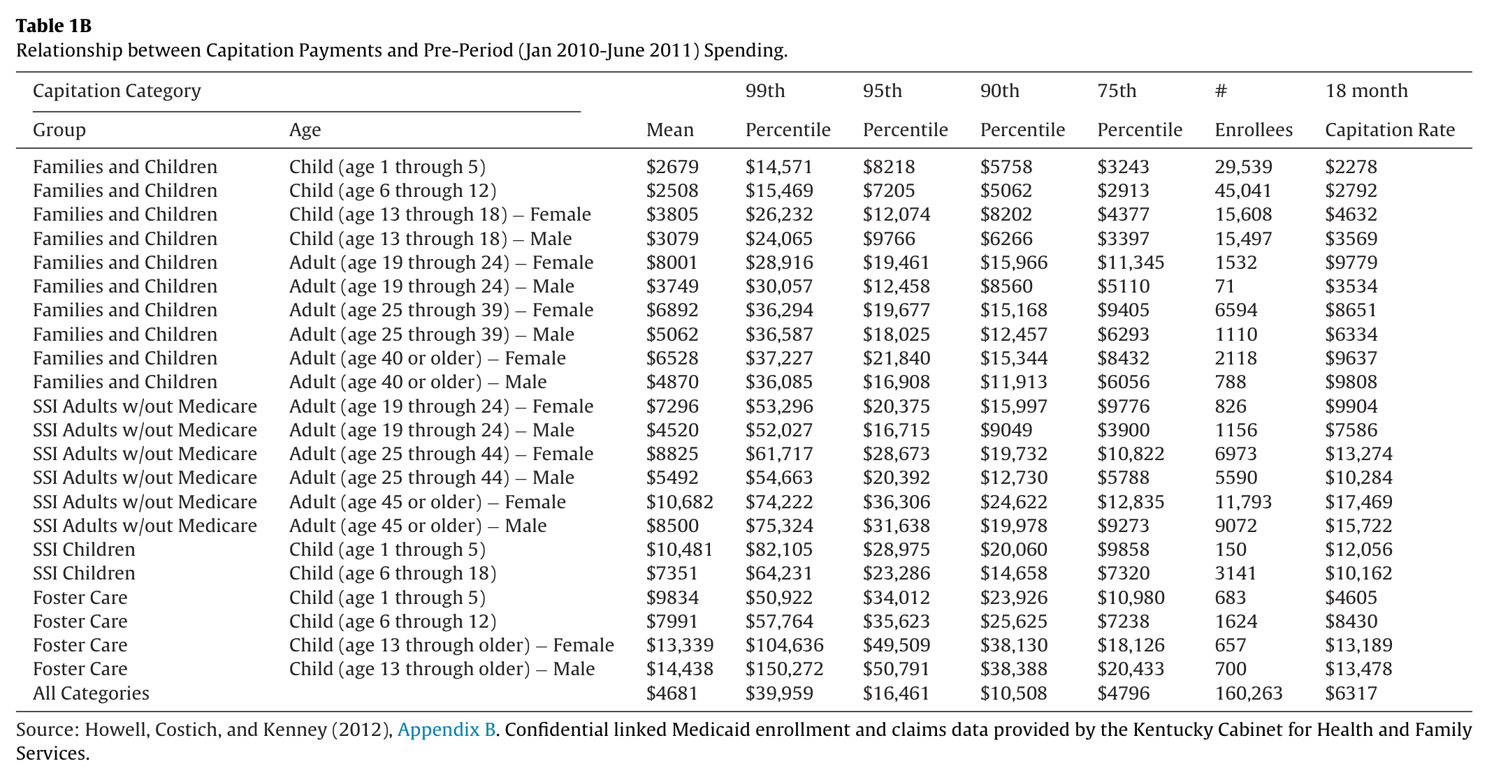
As in Eq. (4), we expect that initial assignment to a plan to increase the likelihood of participation, or . Defining “high” expected medical expenses relative to an enrollee’s auto-assigned bin as opposed to being defined relative to all enrollees merits further discussion. The first column of Table 1B lists the average pre-period (January 2010-June 2011) Medicaid spending for our sample by capitation category. The bottom row aggregates across all capitation categories and illustrates that the average 18 month expense level was $4681, with a high $14,438 for male foster children age 13 and older and a low of $2508 for non-foster/non-SSI children aged 6–12. The last column lists the average 18 month capitation payment blended across the 3 MCOs and 7 regions. The bottom row suggests that the average
capitation payment was $6317, with a high capitation payment of $17,469 for female SSI recipients over age 45 that are not dually enrolled in Medicare and a low of $2278 for non-foster/non-SSI children aged 1 through 5.
These numbers allow us to think about the potential selection impacts of different plan payment mechanisms. One theoretical possibility would be if the state paid each MCO a uniform capitation rate per enrollee equal to the average rate of $6317. This possibility is likely to generate a large amount of adverse selection, implying that this payment system would have a low degree of “fit.”24 For example, MCOs would have a clear preference to encourage lower cost enrollees such as non-foster children to “opt in” to their plan and encourage higher cost enrollees such as SSI and Foster children to opt out. At the alternate theoretical extreme, the state could pay a separate personalized capitation payment for each enrollee. Such a payment
system would minimize adverse selection concerns (and maximize fit), but would be difficult to implement in practice. Kentucky’s choice to establish over 20 separate capitation categories that vary by region represents a degree of risk adjustment that sits between these two extreme possibilities. In this setting, MCOs are largely insured against average variation in expenses across capitation categories, but not against within category variation in expenses. For example, the average capitation payment is higher than average pre-period expenses for all but five of the capitation categories presented in Table 1B, with the biggest deficit being for foster children aged 1–5.
The middle columns of Table 1B list spending percentiles for each capitation category. This illustrates the importance of defining “high” spenders relative to their demographic bin. If we defined high spenders to be those above the 90th percentile of spending across all enrollees, the last row of the table suggests this amount would be $10,508 in pre-period spending.25 For some large groups − such as females aged 25–44 on SSI, or females aged 25–39 who qualify through welfare (i.e. families and children) − roughly one-quarter of the bin had expenses above this threshold. Yet for the SSI bin, the capitation rate of $13,274 makes such “high spenders” profitable, while for the welfare bin, the capitation rate of $8651 makes them unprofitable. For non-foster/non-SSI children, such a level of expenses would generate an average loss for MCOs relative to their capitation category payment levels that vary between about $2500 and $3800. Alternatively, for foster children aged 13 and older such a level of spending would generate an average profit the MCOs. Thus we would not want to uniformly consider individuals with that level of spending to be unattractive to a given MCO.
Table 1B. Relationship between Capitation Payments and Pre-Period (Jan 2010-June 2011) Spending
This is why we define high spenders relative to the appropriate demographic bin.26 As mentioned, a number of assumptions need to be examined for the interpretation of either or to represent inertia (and consequently as representing a reduction in inertia among unhealthy individuals). To a large extent, these assumptions have to do with how the auto-assignment algorithm assigned particular individuals to plans, how individuals valued that plan relative to the other two, and whether the frictions in switching plans were prohibitive.
Although we address all of these issues below (after presentation of the main results), we outline them here. First, for the full sample, we do not want to assume that auto-assignment mimics random assignment. In particular, the algorithm may match individuals based on cost-considerations (i.e. capitation payments, which are a function of demographics, eligibility category and region), plan balancing (i.e. to preserve competition across plans and ensure a critical mass of consumers), overall plan quality, and enrollee-specific plan match (i.e., if the enrollee’s primary care provider is in one plan but not the others, then the match-specific component for assigning to the first plan would be very high).
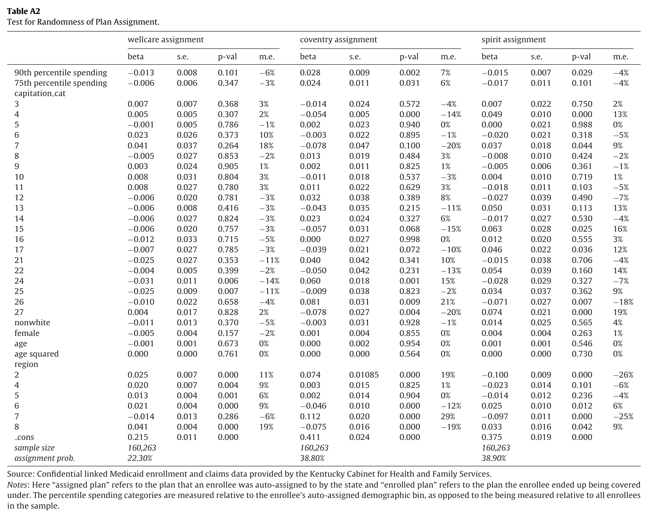
Of most concern for the empirical interpretation of inertia is that the algorithm was sophisticated enough to assign the vast majority of individuals to the plan with the highest match-specific value, in which case one would observe lack of movement but this would not be inertia. We address these concerns by looking at three specific groups of individuals: i) the cost savings sub-sample − individuals who were initially assigned to a plan in their region with the lowest capitation rate (in which case it is plausible to believe that cost-considerations were the over-riding factor), ii) the no cost history sample − new Medicaid enrollees, for whom there simply would not be sufficient utilization data to match the individual to a particular plan, and iii) the as good as random sub-sample − enrollees associated with large providers having approximately equal initial assignment across the three plans (by focusing on providers with equal representation, and controlling for both provider and predetermined individual characteristics, any remaining unobservable differences in initial-assignment are as good as random across plans).27 Another lesser concern has to do with overall plan quality (which likely varies not only by plans, but by regions, given the nature of the provider networks). To the extent that one of the plans is generally better than the other(s) for most enrollees, assignment to the better plan again looks like inertia. However, one would not expect to see inertia for the other two plans.28 Given these questions about the algorithm, we also examine explicitly whether cost factors influence initial assignment. We have capitation rates for Wellcare, Coventry, and Spirit for each of the 22 demographic categories and 7 regions we consider. To examine the state’s initial auto-assignment choices, we estimate models of the form:
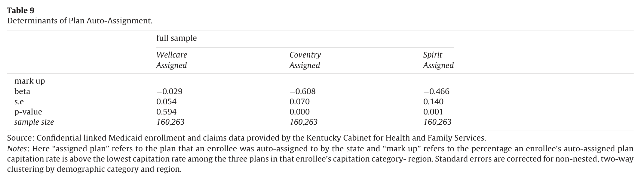
where we predict assignment to plan p for individual i in region r based on , the percentage markup for plan p in capitation rates over the lowest cost plan (where this variable equals zero for the least expensive plan within each of the 154 demographic-region cells), and the markup varies at the demographic-region level, not the individual level. Standard errors are corrected for non-nested, two-way clustering by demographic category and region (Cameron et al., 2011). If cost considerations are an important factor, then , meaning higher mark-ups decrease the likelihood of the state auto-assigning enrollees to that plan.
6. Data
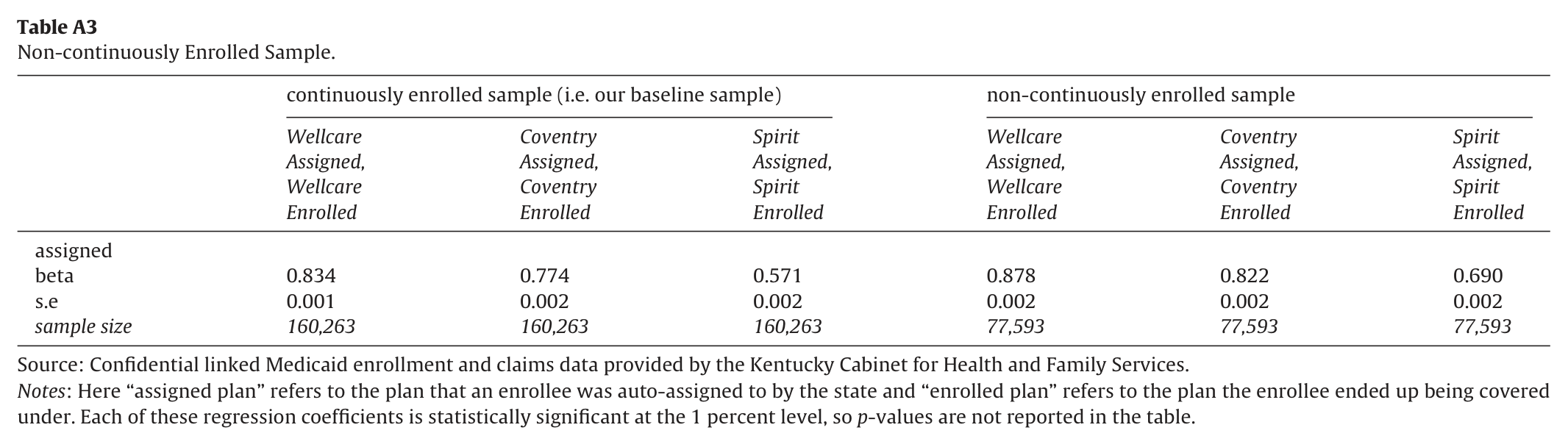
Given that the MMC auto-assignment process started in November 2011, we pulled from the Kentucky Medicaid administrative database all records for each enrollee continuously enrolled between January 2010 and March 2012 not living in region 3 of the state.29 This allows us to observe their pre-managed care (i.e. pre-period) Medicaid spending, their auto-assigned plan for 2012, and the plan they ended up being covered under during 2012. Approximately 370,000 unique enrollees satisfy these criteria. We then drop any enrollees that switch county of residence during this time, leaving us with approximately 300,000 unique enrollees.30 We further restrict our attention to non-elderly enrollees aged one or above with no Medicare coverage, bringing us down to approximately 180,000 unique enrollees. Finally, we drop those carved out of managed care coverage and those with missing values for demographic characteristics of interest. This leaves us with a final sample size of 160,263 unique enrollees.
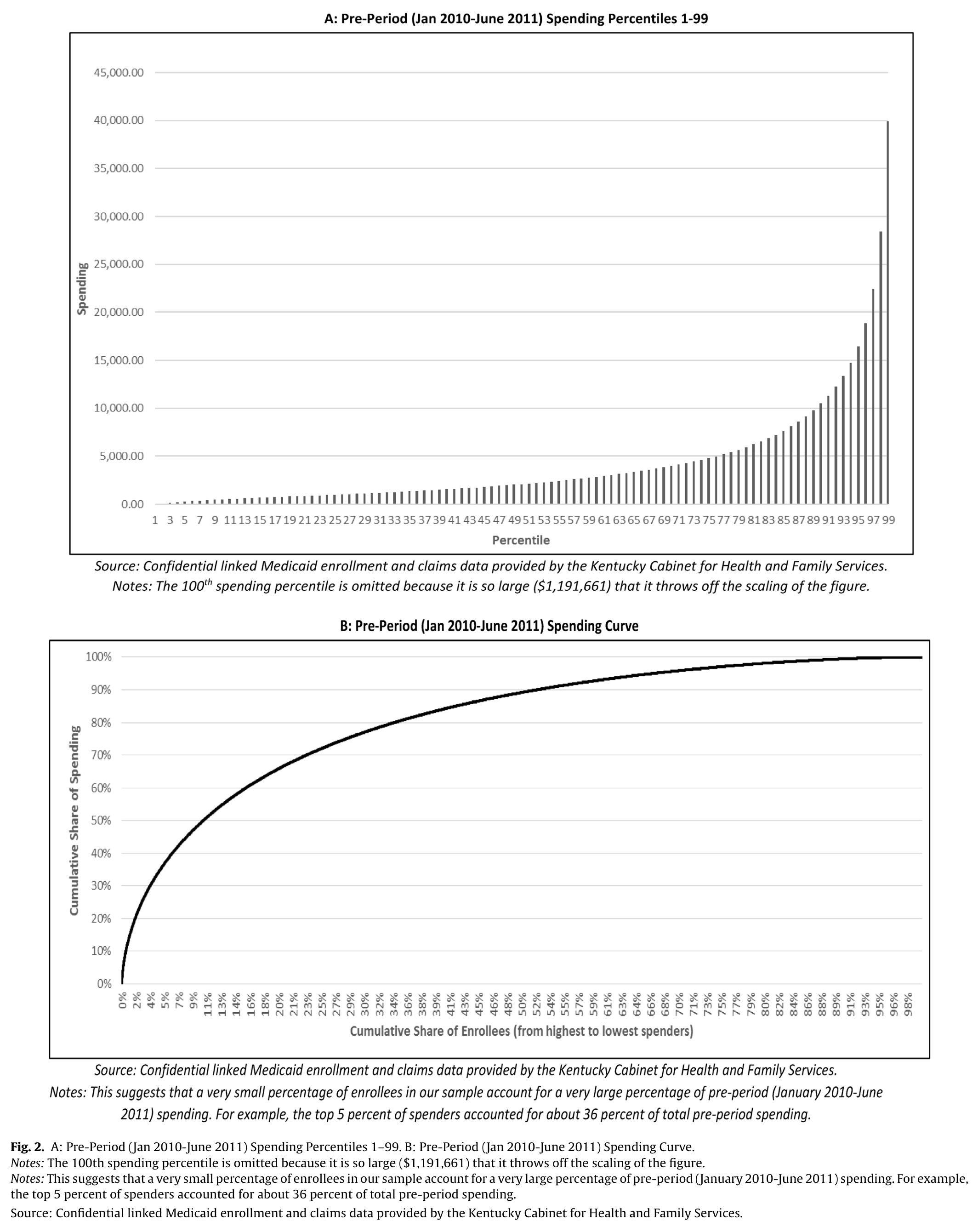
Fig. 2A and B illustrates the distribution of pre-period (January 2010-June 2011) Medicaid spending for our sample of 160,263 enrollees. Fig. 2A presents the spending associated with each percentile of the spending distribution and illustrates the large amount of spending concentrated on the high end of the distribution. As can be seen, for much of the sample spending levels are under $5000 for these 18 months; however, the highest percentiles exceed $25,000. Fig. 2B presents similar information in a different way in order to more easily illustrate what share of all spending can be attributed to what share of enrollees. For example, it suggests that the top 5 percent of enrollees in terms of cost accounted for about 36 percent of all pre-period Medicaid spending, and the top 10 percent accounted for 50 percent. Note that we do not see many individuals (1.51 percent) with $0 expenditures because we are measuring aggregate Medicaid spending over this 18 month period for individuals continuously enrolled in Medicaid throughout that time. The key takeaway from these figures is that the actions of a small number of individuals at the top of the health care spending distribution is of critical importance for the financial stability of the three MCOs. Whether or not these enrollees remain in their auto-assigned plan and which plan they choose if they do opt-out clearly matters for the financial health of each plan, especially in the absence of risk adjustment.
Notes: The 100th spending percentile is omitted because it is so large ($1,191,661) that it throws off the scaling of the figure. The top 5 percent of spenders accounted for about 36 percent of total pre-period spending. Source: Confidential linked Medicaid enrollment and claims data provided by the Kentucky Cabinet for Health and Family Services.
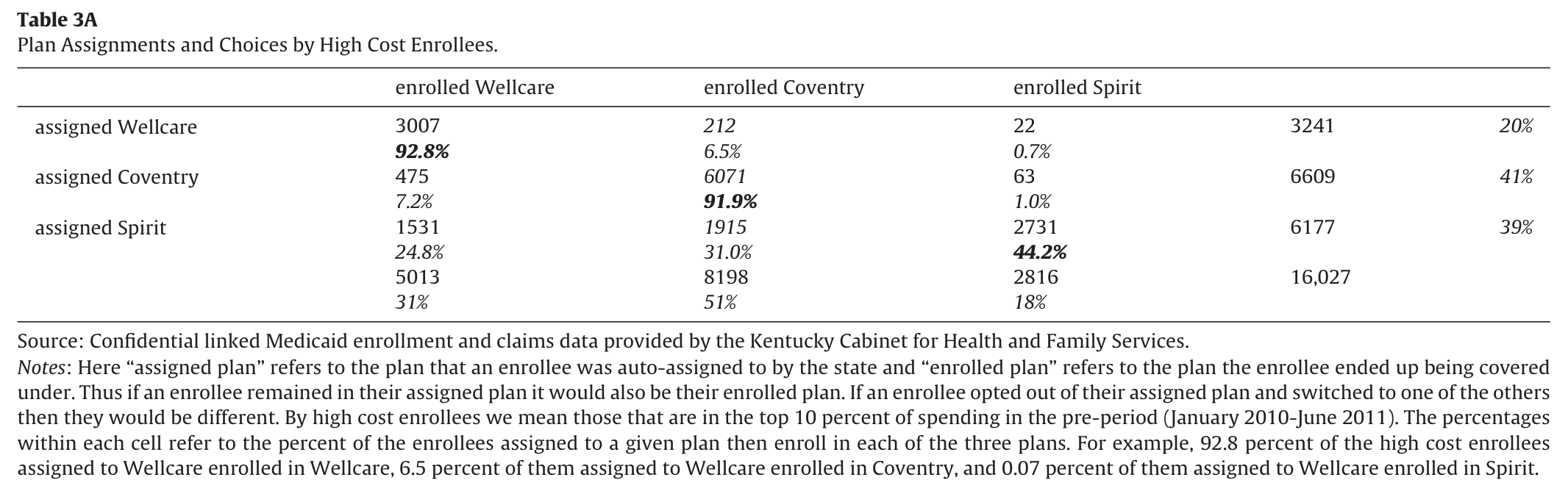
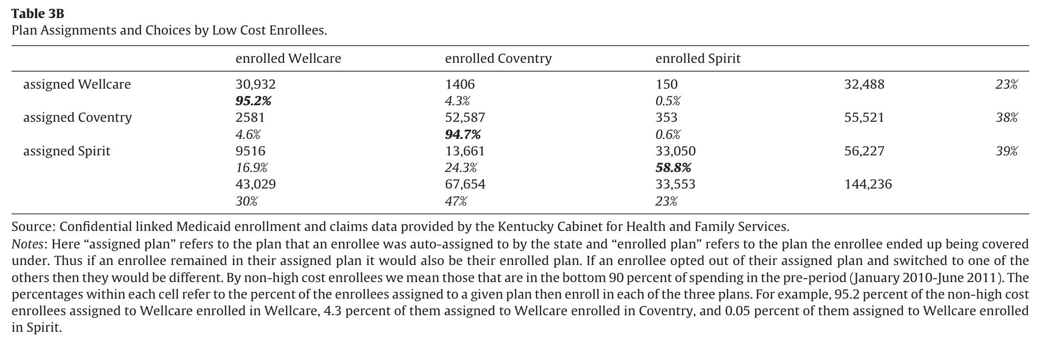
The next several tables describe, both in terms of enrollees and (more importantly) dollars, the distribution across plans in terms of auto-assignment and in terms of final plan choices. Table 2 takes our full sample of 160,263 unique enrollees and divides them in this fashion. Each row represents the enrollee’s assigned plan and we see that 22 percent were initially assigned to Wellcare, 39 percent to Coventry, and 39 percent to Spirit. Thus the state assigned the highest shares to the two plans with the lowest capitation rates, as illustrated in Table 1A. The columns represent the enrollee’s final plan choice. Despite the fact that 39 percent were assigned to Spirit, only 23 percent of the sample was ultimately covered by Spirit. Coventry ended up with 47 percent of the sample, and Wellcare ended up with 30 percent. The individual cells within the table illustrate each combination of assigned and final plan. The diagonals represent those that did not opt-out of their assigned plan and the off-diagonals show us which plan those that opted out ended up selecting. The most striking observations from this table are: first, those assigned to Spirit were much less likely to stay in Spirit (57.3 percent) than those assigned to Wellcare (95.0 percent) or Coventry (94.4 percent). Second, very few of those opting out of Wellcare (0.5 percent) or Coventry (0.7 percent) actively selected the Spirit plan. We see much higher rates of switching into Wellcare and Coventry. To the extent “low-cost” and “low-quality” are interchangeable, one might interpret these results as suggesting that a significant share of enrollees recognized that Spirit was a lower quality plan and behaved accordingly (i.e. opting-out if auto-assigned to Spirit or choosing not to move into Spirit upon opting out of Wellcare or Coventry).31 Tables 3A and 3B explore this further by presenting similar tabulations for the subset of enrollees that account for the top 50 percent of pre-period spending (i.e. the 16,027 “high-cost” enrollees that comprise 10 percent of Medicaid enrollment − type ) and the remaining “low-cost” enrollees (i.e., the 144,236 who comprise 90 percent of enrollment − type ). These tables suggest that high-cost enrollees are more likely than low-cost enrollees to opt-out of their assigned plan. For example, 58.8 percent of low-cost enrollees assigned to Spirit remained in Spirit, while only 44.2 percent of high-cost enrollees assigned to Spirit remained there. Although this is a relatively small sample, their decisions matter greatly for MCO financial sustainability. The pattern we observed of very few enrollees actively opting in to Spirit and more actively opting in to the other plans is also present when we focus on high-cost enrollees. One difference is the active opt-in (off-diagonal) probabilities are uniformly higher among the high-cost enrollees. The idea that a greater fraction of high-cost enrollees would move makes sense, since the net benefits of choosing a plan with a good enrollee-plan specific match is higher for the less healthy. Thus, in the aggregate, both capitation rates and revealed-preference behavior amongst those placing the highest marginal value on making an informed choice suggest that Spirit was, on average, lower quality. It should come as no surprise then that low-cost users − the bottom 90 percent − tend to exhibit greater inertia. About 5 percent opt-out of Wellcare or Coventry, and about 40 percent out of Spirit.
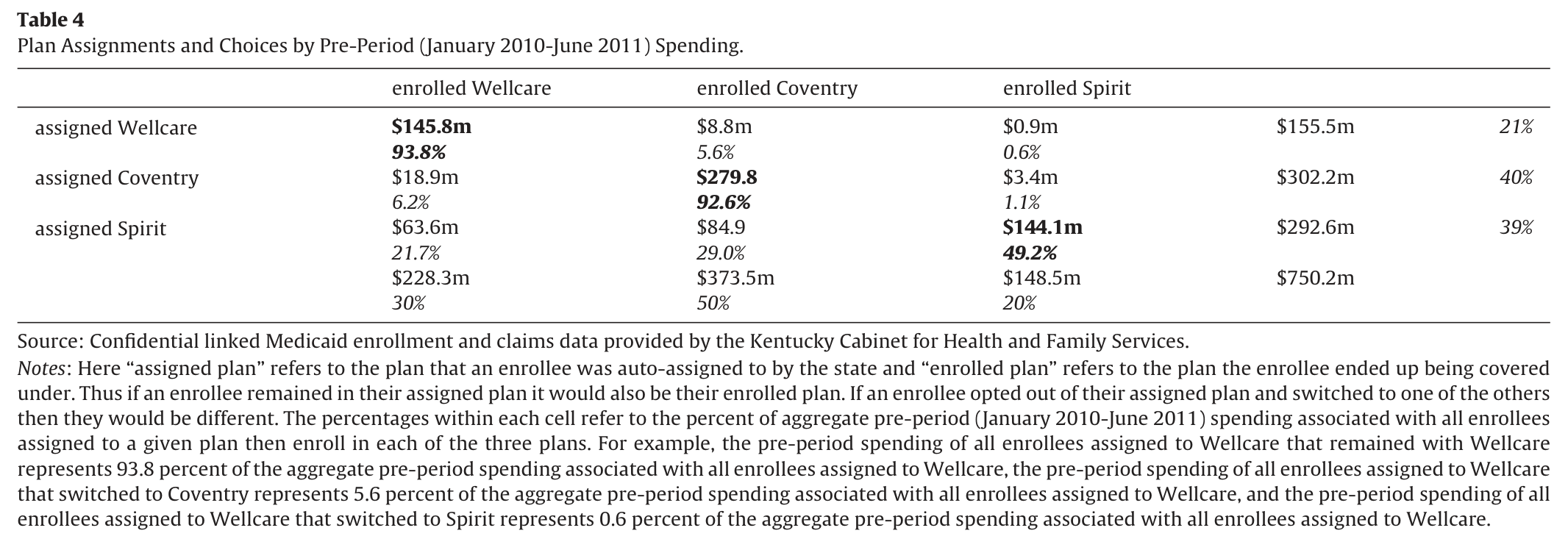
For those who are relatively healthy, the benefits of searching for a new plan are likely lower. Table 4 is similar to Table 2, but rather than focusing on counts of enrollees it instead gives counts of the pre-period (January 2010-June 2011) health care spending associated with each enrollee. Our sample of 160,263 enrollees generated $750,249,362 in Medicaid spending between January 2010 and June 2011. A comparison with Table 2 shows that the state auto-assignment shares of enrollees and lagged health care spending were pretty similar, with Wellcare, Coventry, and Spirit assigned 22, 39, and 39 percent of the enrollees, respectively, and 21, 40, and 39 percent of the lagged spending dollars. If we instead look at shares based on final plan enrollment, we see that while the share of enrollees in Spirit fell from 39 to 23 percent, the share of lagged spending dollars fell from 39 to 20 percent. This suggests negative selection (from the insurer’s perspective) out of Spirit into the other plans. Wellcare ended up with 30 percent of the enrollees and 30 percent of the dollars, while Coventry ended up with 47 percent of the enrollees but 50 percent of the dollars. Thus we observe less inertia for dollars than enrollees, again consistent with high-cost users in all plans being more mobile, but rarely choosing Spirit as their outcome.
Table 4. Plan Assignments and Choices by Pre-Period (January 2010-June 2011) Spending
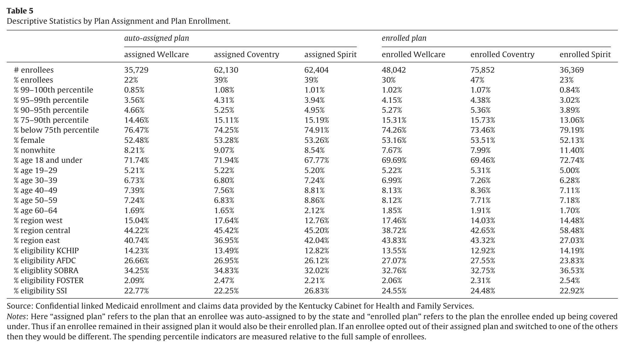
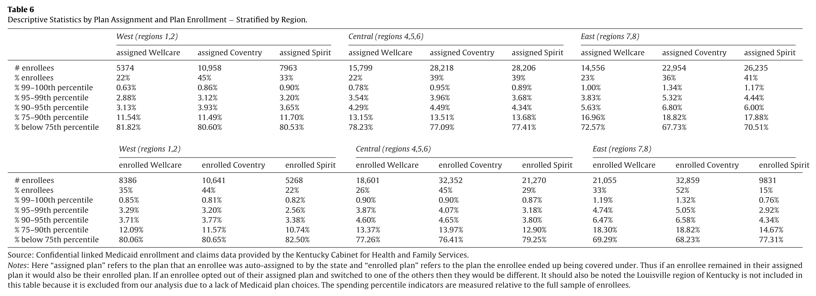
Table 5 presents our descriptive statistics stratified by auto-assigned plan (left panel) and then by enrolled plan (right panel). The first two rows report enrollee counts and shares as in Table 2. The next several rows report the percentage of enrollees that fall within a given range of pre-period (January 2010-June 2011) Medicaid spending. In the right tail of the expense distribution (99th-100th percentile, 95th-99th percentile, 90th-95th percentile), more enrollees were initially assigned to Coventry.32 Under perfect balancing, we would expect each plan to have 1 percent of enrollees in the 99th-100th percentile, 4 percent of enrollees in the 95th-99th percentile, and so forth. While the state assigned slightly lower shares of high-cost enrollees to Wellcare as compared to Coventry or Spirit (left panel), a larger share ended up being covered by Wellcare as compared to Spirit (right panel).33 This echoes what we observed in the previous tables in terms of the movement of lagged spending dollars across plans. We next report averages for gender, race, and age. The allocation of females is pretty uniform in terms of assignment and enrollment, with each plan having approximately 52–53 percent female enrollees. In terms of race, the allocation of non-whites via assignment is also very uniform, though it appears as though some non-whites then opted out of Wellcare and Coventry and in to Spirit. In terms of age, we see a relatively younger age profile among those assigned to Wellcare and Coventry as compared to Spirit. The right panel suggests that older enrollees appeared to shift away from Spirit into Wellcare and Coventry and younger enrollees tended to do the opposite. We see differences in assigned shares of enrollees by eligibility category, with Spirit receiving a higher share of Supplemental Security Income (SSI) recipients (often thought of as high-cost) and a somewhat lower share of Children’s Health Insurance Program (CHIP) recipients (often thought of as low-cost). In terms of final plan coverage though, we see that Spirit ended up with the lowest share of SSI recipients. We also see differences in auto-assigned shares of enrollees by region, with Wellcare and Coventry being assigned more enrollees from western Kentucky and fewer enrollees from eastern Kentucky than Spirit. Opt-outs on the part of enrollees led to a very different regional distribution in terms of final coverage though, as Spirit ended up receiving the smallest share of enrollees in eastern Kentucky. Overall, Table 5 suggests that the state tended to assign enrollees with characteristics associated with relatively high medical costs (older, eligible for Medicaid via SSI, and residing in eastern Kentucky) to the Spirit plan more often than the other plans. These enrollees however tended to opt-out of Spirit (and opt in to Wellcare), as Spirit ended up with the lowest shares of individuals in these categories among the three plans in terms of final plan enrollment. Given the regional differences suggested in Table 5, Table 6 further stratifies the sample by three broad regions of residence (rather than the narrower regions used to set capitation rates). In all three broad regions, Wellcare’s initial share was roughly 22 percent, while Coventry obtained a large share of initial enrollment in the western part of Kentucky and Spirit in the eastern part of Kentucky (and both had equal shares in central Kentucky). In all regions, Wellcare generally started off with the healthiest group of enrollees. We also see that those assigned to each plan in eastern Kentucky are more likely to fall at the top of the spending distribution as compared with the other two regions. This reinforces the fact that the health of eastern Kentucky residents is worse than those in the rest of the state.
Table 5. Descriptive Statistics by Plan Assignment and Plan Enrollment
Comparing auto-assignment to enrollment rates in the west and central regions, there was some exit from Spirit − roughly 10 percentage points − and those individuals disproportionately move to Wellcare. Overall, in those two regions, Spirit’s distribution of expensive enrollees falls for the most part, Wellcare’s increases, and Coventry’s remains quite similar to initial assignment. After such movements, again, the health risk distribution of Wellcare and Coventry look quite similar, and more expensive than Spirit’s. Table 6 shows much more pronounced responses in eastern Kentucky. This is likely tied to the fact that Spirit had considerably more trouble contracting with eastern Kentucky providers as compared to the other plans and as compared to itself in other parts of the state. Although Spirit started off
with the greatest share of enrollees (consistent with Table 1A where Spirit was reported as having the lowest capitation rate in 17 of the 22 demographic groups in the eastern region), its total share fell by 26 percentage points. Those who left were somewhat more likely to move to Coventry than Wellcare. As evidenced by the health risk distribution, Spirit appeared to retain a healthier risk pool.
7. Results
7.1. Basic inertia results and adverse selection results
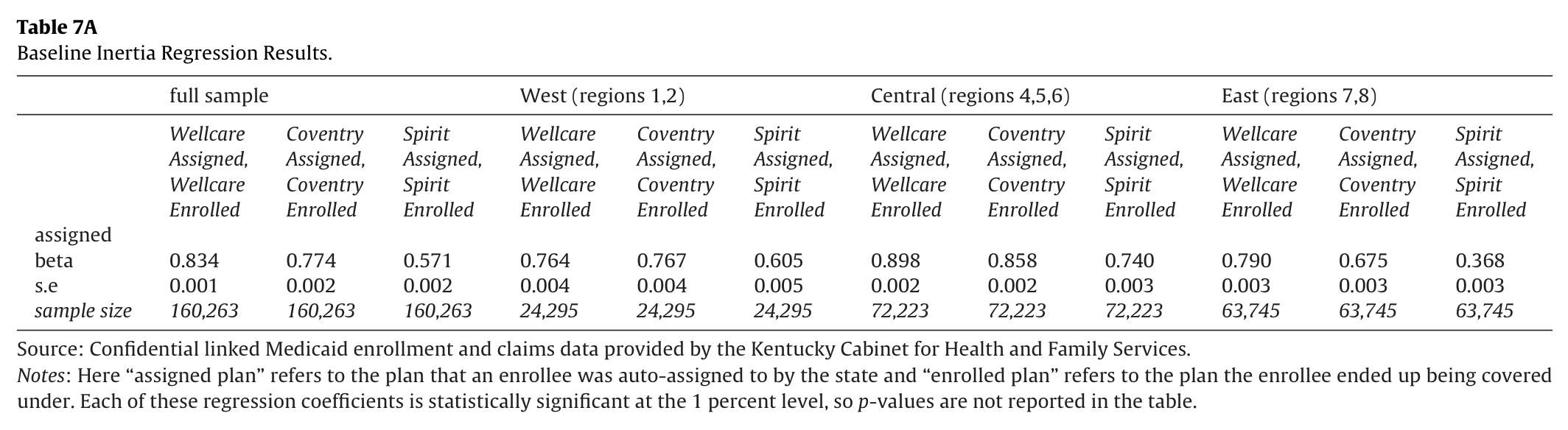
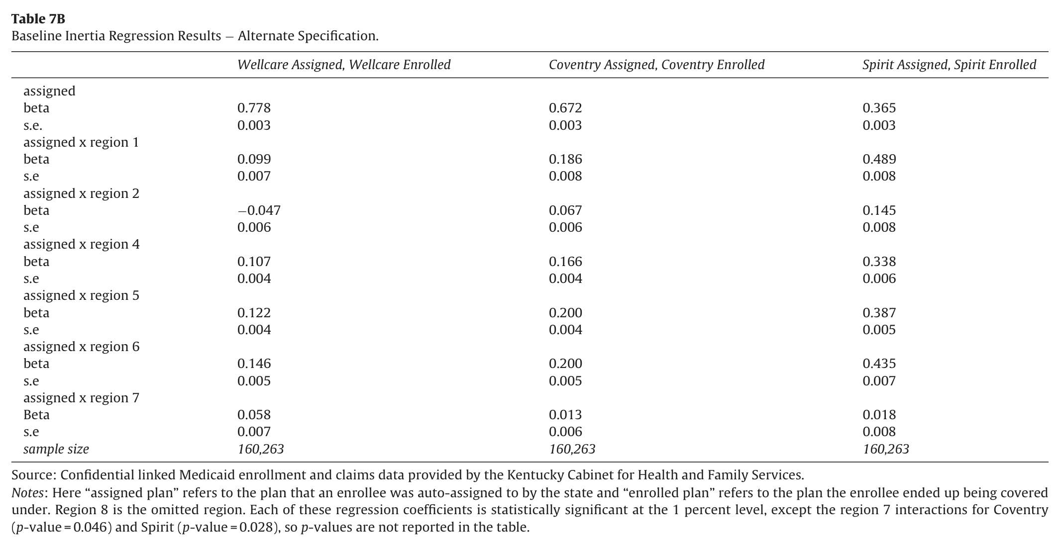
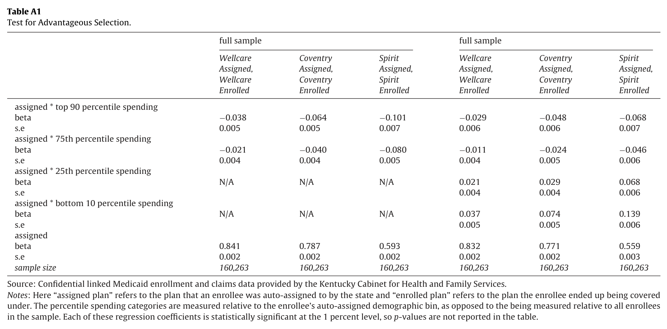
Table 7A provides the first pass at examining inertia, by estimating Eq. (4).34 In the full sample, it is clear that initial assignment matters for enrollment. Assignment to Wellcare increases the likelihood of enrollment in Wellcare by 83 percentage points, assignment in Coventry raises enrollment by 78 percentage points, and assignment in Spirit raises enrollment by 57 percentage points. Note that the first two estimates − for Wellcare and Coventry − are lower than the off-diagonal in Table 2, because of mobility from the other “not Wellcare” or “not Coventry” bins. When one breaks out the results by broad region, a more nuanced picture emerges. Inertia is not all that much different across plans in the western and central parts of the state (although fewer individuals clearly stay in Spirit). However, in the eastern part of the state, there was less overall inertia, and substantially less inertia in Spirit. Assignment to Spirit raises participation in Spirit by 37 percentage points, much lower than in the west region (61 percentage points) or the central region (74 percentage points). Given the well-known and public difficulties of Spirit in eastern Kentucky, one might surmise that more individuals exerted effort to leave what they viewed as an inferior plan. Table 7B presents the results of an alternate specification where we estimate a separate regression for each plan in which the plan assignment variable is interacted with the set of regional indicators. As in Table 7A, the results of Table 7B suggest that plan auto-assignment is highly predictive of plan enrollment and that this is less the case for Spirit as compared to the other two plans, especially in eastern Kentucky.
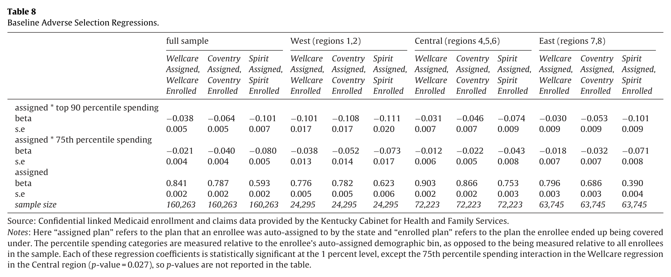
Our test for adverse selection is illustrated in Table 8. What we see is that is that “inertia” might be viewed in a similar fashion to Handel’s (2013) interpretation as a tangible switching cost. Those with the greatest incentive to shop around − the highest expense individuals within a demographic bin (type ) − stuck far less to initial assignment than healthier individuals (type ). For example, in the full sample, assignment to Wellcare raised participation in Wellcare by 84 percentage points for low-cost individuals, but only by 80 percentage points for high-cost individuals (top 10 percent of expenses). Assignment to Coventry raised participation by 79 percentage points for low-cost individuals, but only by 73 percentage points for high-cost ones. And assignment to Spirit raised participation by 59 percentage points for the healthy, but only 49 percentage points for the unhealthy. The pattern is also monotonic: exits are most pronounced for the top 10 percent of the expense distribution (although very similar within that 10 percent), and are less pronounced but still sizable for the next 15 percent of the spending distribution.35 Results in eastern Kentucky follow the same pattern, but that panel shows very low inertia for high expense individuals in Spirit. Initial assignment to Spirit is associated with a 39 percentage point increase for healthy individuals, but just a 29 percentage point increase for high-cost ones.
The principal concern with the inertia regressions is the interpretation of the coefficients. Lack of mobility could stem from inertia − as we have defined it − or could indicate a good match between the enrollee and provider. If lack of mobility represents the former, we could expect that if the state had instead assigned the enrollee to a different plan, they would have largely “stuck” in that plan. However, if immobility stems from good individual matches, assigning the enrollee to a different plan would then lead to significant mobility.
To address this identification issue, we first exploit the fact that we have capitation rates for all three plans. Table 9 examines the impact of higher capitation mark-ups on assignment to the three plans. For both Coventry and Spirit, higher percentage mark-ups − above the lowest cost plan for a particular demographic-region bin − lead to significantly fewer plan assignments. The effect is large for these two plans; a capitation rate that is 10 percent above the lowest baseline rate leads to a decline in assignment of 6.1 percentage points for Coventry and 4.7 percentage points for Spirit. Conditional on not being the lowest plan, the average Spirit mark-up was 7.9 percent, and the average Coventry mark-up was 8.4 percent. Wellcare was never the lowest cost plan, and the average mark-up was 11.8 percent. However, the effect of Wellcare’s mark-up on assignment is both insignificant and much smaller in magnitude, perhaps consistent with notion that the state assigned recipients to that plan for either plan balancing or quality considerations.36
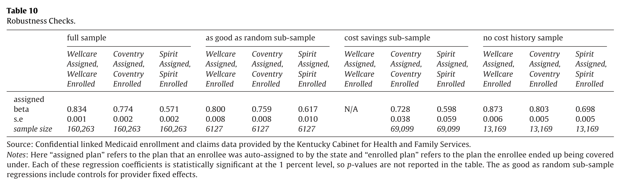
Table 10 presents the results of three additional robustness checks.37 The first panel re-states our baseline inertia results from Table 7A. The second panel reports estimates from the same specification using our as good as random sub-sample (with the addition of fixed effects for the twenty-three large providers associated with this sub-sample). The fact that the coefficients produced by the as good as random sub-sample are very similar to those produced by our baseline analysis lends support to the view that lack of enrollee movement is due to inertia rather than the quality of the enrollee-plan match.
Based on both our as good as random sub-sample analysis and our analysis of capitation mark-ups, we conclude that for individuals assigned to the lowest-cost plan—along with the ample anecdotal evidence from Palmer et al. (2012)—it is not completely unreasonable to assume that cost considerations rather than quality of the individual match were likely to be the overriding consideration. Next, we re-estimate our baseline inertia regressions, restricting the sample to the 43 percent of individuals (69,099 out of 160,263) who were assigned to a low-cost plan.38 As such, we estimate such mobility regressions for Coventry and Spirit only and the sample consists of people who were initially assigned to one of these two plans; the same covariates are included as before. Identification is achieved because there is variation within demographic-region bins with respect to whether Coventry or Spirit is the lowest cost plan.39
What we observe in the third panel of Table 10 is that assignment to Coventry (relative to “not Coventry”—which is assignment to Spirit instead of assignment to both Spirit and Wellcare) raises participation by 73 percentage points, very similar to the 77 percentage point increase produced by our full sample. For those assigned to Spirit, participation is increased by 60 percentage points, relative to the baseline estimate of 57 percentage points. Thus, estimates of inertia—where cost considerations rather than quality-of-match are likely the overriding concern—are essentially the same magnitude as for the full sample. Given this similarity in coefficients to the baseline, it is difficult to believe that enrollee-specific match quality is an important factor in explaining lack of mobility.40
Next, we perform a second test motivated by Handel (2013). In his analysis of health plan inertia within a large employer, he examines a sample of employees enrolled over several years (t−1 to t+1) in order to model expected costs and choices, meaning he has medical data for the health insurance choice at t=0. Importantly, he notes that new employees do not have medical histories, making it more difficult to model expected expenses. Lack of utilization history for enrollees in Medicaid makes it far more difficult for auto-assignment to match based on expected medical expenses. We therefore examine an entirely new sample of 13,169 individuals who were not enrolled in Medicaid at any time between January 2010 and June 2011. Instead, such individuals signed up for the program between July 2011 and November 2011 (and remain enrolled through March 2012). We can only estimate the baseline inertia regressions, not the adverse selection regressions, due to this restriction on medical histories. However, assignment to plans for these baseline regressions should not be related to the enrollee-specific quality of match. In addition, we can estimate these regressions for auto-assignment for all three plans. The fourth panel of Table 10 presents the results of our inertia analysis for this no cost history sample. For each plan the patterns are similar to our baseline results. The coefficients for Wellcare and Coventry are within 4 percentage points of our baseline estimates. We still see more mobility among those assigned to Spirit.
In summary, it is important to distinguish between lack of mobility due to inertia and quality-of-match. These robustness checks suggest quite strongly that almost all of the immobility is due to inertia. Thus, we proceed forward with policy implications assuming that the estimated coefficients are causal and would therefore apply to those who were not auto-assigned to a particular plan.
Our empirical results above establish several stylized facts. First, the auto-assignment default did lead to inertia in all three plans but the level varied substantially based on overall plan quality. Second, those with the greatest incentive to switch did so − individuals with high health expenses had substantially higher mobility in all three plans. Third, a substantial number of enrollees − 43 percent − were assigned to plans with the lowest of three capitation rates; for this group, where cost-considerations rather than good enrollee-plan match were likely the critical consideration in the state’s algorithm. We observe nearly identical mobility rates as for the full sample, and nearly identical adverse selection behavior. From this, as well as our other robustness checks, we infer that immobility due to good initial enrollee-plan matches is unlikely to be a major explanation for our results. Thus, in deriving policy implications below, we will assume that the mobility rates based on initial plan assignment can be extrapolated to other Medicaid enrollees who were not assigned to that same plan. For instance, we would assume that had 100 people who had actually been initially assigned to Wellcare (i.e., where the baseline inertia results show 84 additional people would enroll in Wellcare based) instead been assigned to Spirit, then 57 would remain in Spirit.
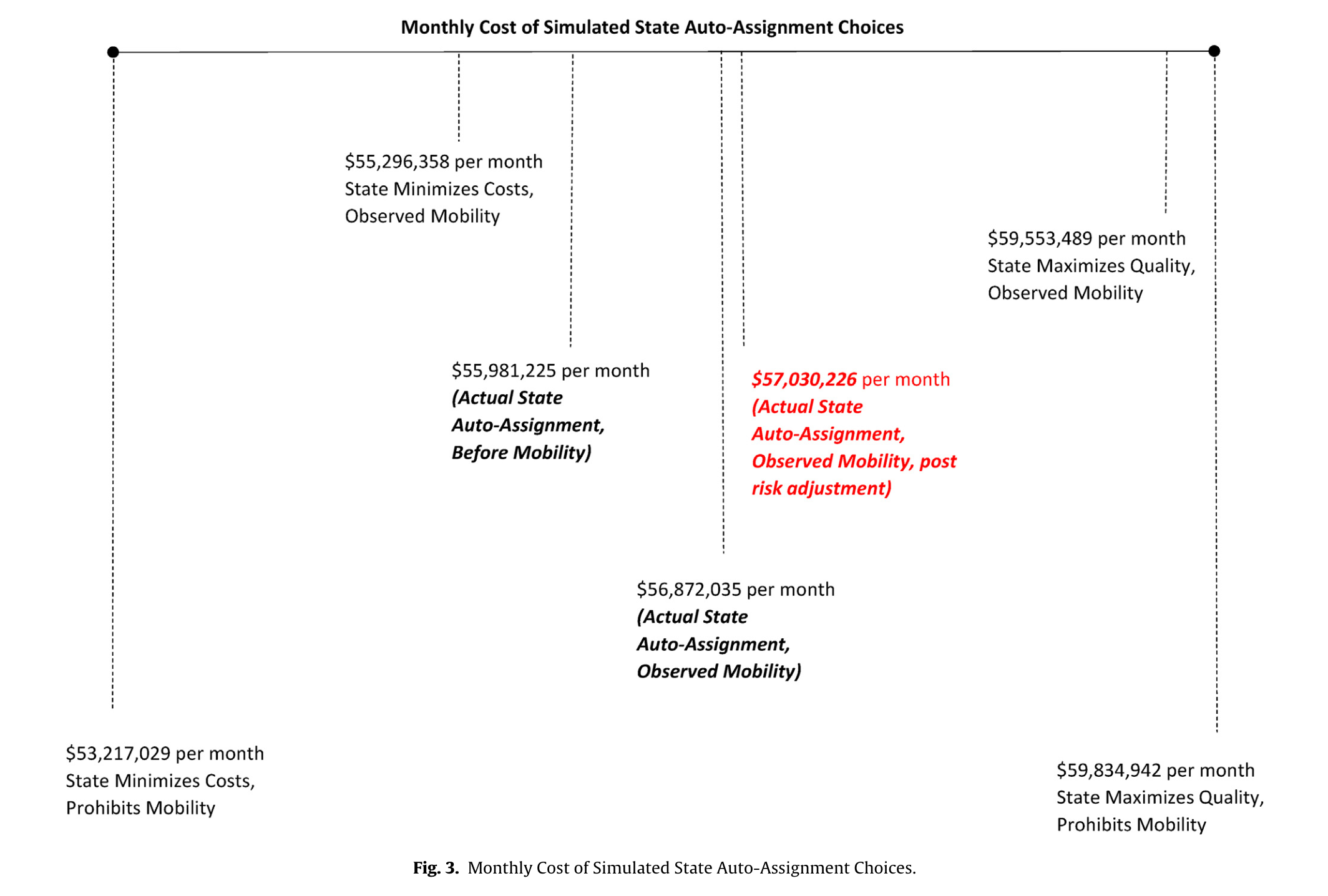
Given these findings, we conduct a policy simulation that proceeds in several steps. Our conceptual model posited that the state’s objective is to minimize costs, subject to (roughly) balancing enrollments across plans. As noted previously, for each of 22 demographic cells and 7 regions (154 cells), we obtained the first-year capitation rates for each of the three plans.41 As an initial (and unrealistic) benchmark, we ask: What would monthly capitation payments from the state to MCOs have been if the state simply assigned each enrollee to the lowest capitation plan, and enrollees were prohibited from switching plans? Table 1A showed that such a cost-minimization strategy involves assigning individuals to only Spirit and Coventry, not Wellcare. In the aggregate Fig. 3 shows such a strategy
for our sample of 160,263 individuals results in $53.2 million in monthly capitation payments. Assuming that capitation rates for each of the 154 demographic-region cells are perfect proxies for the overall quality of each plan (for that particular cell), we could also ask: What would monthly capitation payments from the state to MCOs have been if the state assigned each enrollee to the highest quality plan, and enrollees were again prohibited from switching plans? That is, the highest capitation rate plan reflects the highest quality or most comprehensive plan.42 If all individuals in our sample were assigned to the highest quality plan (and prohibited from moving), monthly capitation payments would be $59.8 million.
Those two endpoints, of course, are unrealistic because individuals were able to switch plans, and such capitation payments could only be achieved with complete inertia. We therefore ask two parallel questions: With observed mobility rates and transitions across plans, what would be the aggregate state capitation payment if the state initially assigned each individual to the lowest cost plan or the highest quality (highest cost) plan? For each of the 154 demographic-region cells, we assume that the observed mobility rates based on initial assignment generalize to all individuals in that cell; this assumption is supported by the robustness checks.43 If we assume the state pursues a cost-minimization strategy − thus assigning all individuals to only Spirit or Coventry depending on the capitation
rates in the 154 cells − and that the enrollees then stay in that plan or move to one of the other two plans based on observed behavior
for those who were actually assigned to that low-cost plan, total capitation payments would be $55.3 million. Although the state controls initial assignment, the estimated coefficients in Table 7A show a great deal of movement out of Spirit, which was often the low-cost plan. If the state pursued a “quality maximization” strategy by assigning individuals to the high-cost plan, total monthly capitation payments would be $59.6 million, very close to $59.8 million where mobility was prohibited. This is unsurprising, since the level of inertia reported in Table 7A (especially for Wellcare) was quite high, and Wellcare was often the high-quality plan. If quality-maximization had been the goal, one would observe very little movement of enrollees (presumably because only a small fraction of enrollees
would have had a better enrollee-plan match to pursue).
Given these theoretical extremes based on hypothetical state auto-assignment strategies, our next question is: Relative to the $55.3 million and $59.6 million endpoints, what were the monthly capitation payments from the state to the MCOs based on the state’s actual assignment algorithm and the observed mobility of enrollees? The state initially allocated 22 percent of individuals to Wellcare, and 39 percent of individuals each to Coventry and Spirit. Capitation payments based on this initial assignment would have resulted in $56.0 million in expenditure per month. After allowing for the actual switching observed during open enrollment, which typically resulted in enrollees moving to higher quality (higher capitation) rate plans, state expenditure was $56.9 million. Finally, after actual switching and adverse selection during open enrollment, Kentucky risk-adjusted the
capitation rates in a budget-neutral manner. Coventry generally saw increases in capitation rates, including across-the-board increases in eastern Kentucky. With only a few exceptions, Spirit saw decreases in capitation rates, including across-the-board cuts in eastern Kentucky. The impacts on Wellcare were more muted, with some increase and other decreases. As seen in the figure, the monthly capitation spending of $57.0 million is nearly identical to the $56.9 million prior to risk adjustment; thus it was budget-neutral.44 Given the federal requirement to allow mobility, the state’s actual behavior appears to be much closer to a cost-minimization strategy than a quality-maximization strategy. Had the state assigned all individuals to the lowest cost plan, and then individuals moved according to the actual mobility patterns for
those in the low-cost plans, Wellcare would have ended up with roughly 13 percent of enrollees, Coventry with 51 percent, and Spirit with the remaining 36 percent. Such an allocation would have undermined the state’s “plan balancing” objective, which suggests steps were taken to auto-assign more individuals in Wellcare and fewer in Coventry to achieve this balance. Taking into consideration the desire to better balance enrollments (which raises capitation payments by increasing Wellcare’s auto-assigned share), it appears that the state’s actual objective was likely focused on minimizing costs.
Figure 3. Monthly Cost of Simulated State Auto-Assignment Choices
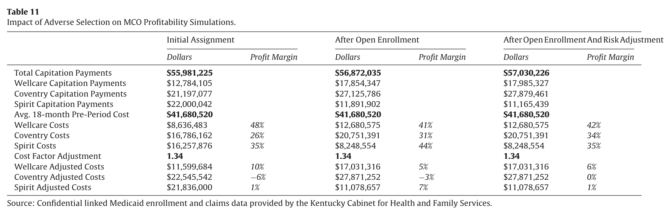
The above analysis focuses on the state’s perspective. Yet Table 8 demonstrated substantial adverse selection: high-cost individuals were far more mobile than low-cost individuals. From the MCO’s perspective, movement of unprofitable enrollees out of their plan (capitation rate minus expected cost) raises profits, as does retaining (or attracting) profitable ones. To the extent that there were differential movements of unprofitable enrollees, then some plans would likely experience losses. MCOs may have tried to cherry-pick profitable enrollees away from other plans. In the Kentucky context, some providers enticed enrollees to join their plan by offering such incentives as free diapers and free strollers (Palmer et al., 2012).45 The impact of the actual capitation rates and medical expenses, combined with the demonstrated adverse selection, allows for an analysis of profitability. One important caveat should be kept in mind: the three plans − depending on the region − offered very different access to care, potentially creating differing amounts of subsequent utilization apart from underlying health status. Thus, we do not use actual expenditure of enrollees in the first plan year, but the pre-determined average monthly expenditure of each enrollee between January 2010 and June 2011. Table 11 examines MCO profitability under three scenarios: first, under the actual initial auto-assignment of enrollees to plans by the state,
second, after open enrollment was completed, and, third, after a budget-neutral risk-adjustment to the capitation rates. As mentioned, total capitation payments would have been $56.0 million based on initial assignment and $56.9 million after observed enrollee movement across plans. The table shows that the allocation of payments across three plans changed dramatically between initial assignment and the end of open enrollment, due to enrollee mobility and differing capitation rates received by each plan. Both Wellcare’s and Coventry’s share of payments rose by about 10 percentage points, while Spirit’s share fell by about 20 percentage points.
Based on the average monthly costs between January 2010 and June 2011, aggregate expected MCO expenditures would be $41.7 million, and therefore lead to very high profit margins for all plans. It is important to note that capitation rates would include not only the continuously enrolled individuals, but the expected costs of more recently enrolled ones. It would also include administrative costs estimated to be between 8–11 percent (Palmer et al., 2012), rising prices due to health care inflation, and expected savings due to the switch from FFS to managed care. We scale-up this cost measure by a factor of 1.34 ($56.0 million in capitation payments divided by $41.7 million in medical expense) under the assumption that the capitation rates computed in the aggregate will be actuarially fair
at time of initial assignment. After this adjustment to costs, the profit margin implied by auto-assignment was +11 percent for Wellcare, −6 percent for Coventry, and +1 percent for Spirit. The impact of adverse selection from open enrollment is noticeable. After open enrollment, profit margins were +5 percent for Wellcare, −3 percent for Coventry, and +7 percent for Spirit.46 This is a result of many more high risk enrollees leaving Spirit, raising its overall profit margin, and migrating to Wellcare. Coventry continued to lose money, although its loss margin narrowed. The analysis lends credence to Coventry’s claim that its losses were attributable to its sicker membership (Palmer et al., 2012). Finally, we incorporate the budget-neutral risk adjusted capitation payments in the last column. Most importantly, Coventry’s margin increases from −3 percent to 0 percent, and Spirit’s falls from +7 percent to +1 percent. Thus, the risk adjustment clearly helped Coventry’s profit margin, at the expense of Spirit. Non-negative profit margins for all plans suggests the risk adjustment mechanism enhanced market stability, even though it came at the expense of expanding the state’s Medicaid budget to some degree relative to that based on the initial auto-assignment and capitation rates.
Table 11. Impact of Adverse Selection on MCO Profitability Simulations
The calculations therefore demonstrate the importance of adverse selection in changing profit margins. Payments and quality varied by plan, and higher risks within the 154 demographic-region cells tended to respond more to quality. It also highlights the important role for risk adjustment. Thus, the competing goals of preserving competition and plan choice, along with the strong incentives for Medicaid enrollees to opt into expensive plans, creates losses (or narrows profit margins) for some MCOs. Interestingly, although Coventry lost money prior to risk adjustment, the migration of adversely selected individuals did not contribute to those losses. Rather, the sizable profit margins for WellCare were narrowed due to adverse selection, while margins for Spirit increased due to exits of unhealthy individuals. Risk adjustment,
in turn, redistributed based on this adverse selection.
One objective of the state is likely insurance market stability. Spirit’s withdrawal from the market in July 2013 clearly works against such an objective. Is Kentucky’s risk adjustment mechanism to blame? Although risk adjustment certainly lowered Spirit’s margins, the risk adjustment does not appear overly punitive since Spirit’s profit margin remained at +1 percent after risk adjustment.
Instead, other factors appear to matter as well. In litigation, Spirit alleged that they set their capitation rates based on a flawed 2011 “Data Book” produced by PriceWaterhouseCoopers; however, both Coventry and Wellcare relied on the same information (and our reading of the legal settlement is that such issues were minor).
Our view, based on Palmer et al. (2012), is that the timeline from RFP to implementation was very ambitious (in all likelihood due to political reasons) and Spirit relied on a strategy of “low bids, high enrollment, and aggressive provider negotiation.” The negotiations with providers fell apart. In response to their wellpublicized access issues, there was a large amount of flight during the open enrollment, especially among the highest-cost assignees.
From there, capitation rates fell from their already low levels due to risk adjustment. In addition, Spirit also then had a much smaller pool of individuals. Falling capitation rates appear to be a consequence of not being able to put together a viable provider network, which in turn could be due to a rushed implementation or overconfidence on the part of Spirit (after all, the other two providers were much more successful in putting networks together). Given the subsequent entry of other MCOs after the initial 2011 rollout, it does not appear as if the state was paying too little in general.
8. Auto-assignment strategies and welfare implications
In this section, we discuss how the state’s auto-assignment strategy might vary under different assumptions about the presence of mobility/inertia, the observability of mobility type, and the degree to which the state’s Medicaid budget is fixed. This discussion is based on our economic model and our empirical results. While identification issues prevent us from estimating the structural parameters of our economic model in the same fashion as Handel (2013), we believe our model does allow for a qualitative discussion of the welfare implications of different auto-assignment strategies.
Our economic model and our empirical results both suggest that the state’s objective is to minimize costs, subject potentially to some concern about balancing initial enrollment counts across plans via auto-assignment. For simplicity, assume that the state is exogenously faced with two plans that differ in initial quality, where we proxy plan quality by average cost per enrollee if all enrollees were in that plan. The high quality plan is denoted by and the low quality plan is denoted by .
8.1. Mobility type (m) and health type (h) are observable
In this setting, the state’s pure cost-minimizing auto-assignment strategy would allocate all inert enrollees (type ) to the low-quality plan () and all mobile enrollees (type ) to the high-quality plan (). The state should be indifferent between assigning mobile enrollees to either plan from a cost perspective.
This is because if assigned to plan , each of those enrollees would always choose to incur their “low” switching cost and move into plan . If the state also cares about initial plan balance, then some mobile enrollees are likely to be assigned to plan (if the majority of individuals are mobile). Such a strategy generates a welfare loss for the mobile enrollees equal to the number of mobile enrollees auto-assigned to plan times the mobile enrollee type switching cost. Regardless of how the mobile enrollees are auto-assigned, all inert enrollees will end up enrolled in plan and all mobile enrollees will end up enrolled in plan .
If we denote by the expected cost of an enrollee of health type if enrolled in plan , then we can define the total cost the state incurs due to its Medicaid program as follows:
We denote by the total cost associated with all mobility type enrollees in plan and all mobility type enrollees in plan . Similarly, Equations (8a) and (8b) define the per-enrollee risk-adjusted capitation payment the state makes to each plan under this allocation of enrollees.
If we were able to estimate a structural model, we would be able to produce estimates of this aggregate enrollee welfare equation.
As discussed in the previous section, risk adjustment would tend to equalize MCO profits, pushing them towards zero. If we also assume that this level of Medicaid spending (i.e. ) equals the Medicaid budget imposed by taxpayers, then taxpayers are receiving the level of Medicaid spending they prefer.
How would things change in this setting in the absence of inertia? Regardless of the state’s auto-assignment strategy, all enrollees would end up in plan . This would lead to an increase in total cost equal to the cost increase between plan and plan for each previously inert enrollee, which we denote by for each previously inert sick, high-cost enrollee and for previously inert healthy, low-cost enrollee. Thus the welfare of the previously inert enrollees would increase as they move from plan to plan . This would come at the expense of taxpayer welfare, as the cost associated with the Medicaid program increases above .47 Risk adjustment would again tend to equalize MCO profits, pushing them towards zero.
If state Medicaid spending was not allowed to increase above , then the alternative is have the state offer one medium quality plan defined by:
Here previously inert enrollees receive an increase in welfare as they are forced to move from plan to plan , while mobile enrollees suffer a welfare reduction as they are forced to move from plan to plan . Thus the aggregate welfare impact on Medicaid enrollees is unclear. Taxpayers are responsible for the same level of Medicaid expenditure as in the presence of inertia, so there is no change in their welfare. Risk adjustment would again tend to equalize MCO profits, pushing them towards zero.
How would things change in this setting with full inertia? If the state pursed a pure cost minimization strategy, then they would assign all enrollees to plan . This would reduce the welfare of the previously mobile enrollees that would have moved in plan . At the same time, the reduction in Medicaid spending associated with those enrollees would lead to taxpayer savings.
To the extent the state also cares about initial plan balance, then it would not pursue a pure cost-minimization strategy and instead auto-assign some enrollees to plan . If some of those enrollees were part of the previously mobile group, then this would mitigate to some extent that group’s welfare reduction described above as well as the savings this would generate for taxpayers. Risk adjustment would tend to equalize MCO profits, pushing them towards zero.
8.2. Mobility type (m) is unobservable, but health type (h) is observable
Under the alternative assumptions that individual-level inertia is unobserved and initial plan balance considerations were irrelevant, the state’s pure cost-minimizing strategy would be to assign all enrollees to plan . The mobile enrollees would then move into plan . Thus, this strategy would result in the same final distribution of enrollees across plans as generated in setting 1–all inert enrollees (type ) in plan and all mobile enrollees (type ) in plan . This would generate the same total Medicaid spending of as above. The only difference from setting 1 is that under this auto-assignment strategy, all mobile enrollees are forced to incur the low, but non-zero, hassle cost associated with switching from plan into plan .
As suggested by our empirical analysis, let us now assume high-cost, sick enrollees (type ) have a certain average level of inertia denoted by , and low-cost, healthy enrollees (type ) have a certain average level of inertia denoted by , where (e.g., in eastern Kentucky − from Table 8). If we assume that the state takes initial plan balance into consideration, then relative to a strategy of assigning all enrollees to plan , the state would have to consider both differences in average inertia and differences in expected cost increases for the two health types as it decides which enrollees to shift from plan to plan .
Denote the expected cost increase for a given health type is , where is the cost increase for health type by switching from plan to plan . It is plausible that costs increase more quickly for type enrollees after being reallocated to plan , or . If the greater amount of inertia for low-cost, healthy enrollees multiplied by their smaller expected cost increase is less than the same product for high-cost, sick enrollees, then the following inequality holds:
In this case, the state would initially move health type enrollees into plan until the desired plan balance is achieved; only after these health types were exhausted would the state change the auto-assignment of the other health type.48 From a welfare perspective, we would expect all mobile enrollees to end up in plan and the inert enrollees assigned to each plan remaining in those plans. Thus, to the extent the state is able to still assign inert enrollees to plan in this setting with less information, the state’s total cost will approach . However, the more inert enrollees that are assigned to plan , the higher the state’s total cost would be.
8.3. Mobility type (m) and health type (h) are unobservable
If both inertia and health type are unobserved, the state’s cost-minimizing auto-assignment strategy would be to assign as large of a portion of Medicaid enrollees to plan as possible, subject to initial plan balancing constraints. This strategy would result in the same final distribution of enrollees across plans as generated in setting 1–all inert enrollees (type ) in plan and all mobile enrollees (type ) in plan . This would generate total Medicaid spending of as in setting 1. Risk adjustment would again tend to equalize MCO profits, pushing them towards zero.
In a number of other settings, such as Handel (2013) and Polyakova (2016), inertia leads to equilibria that would unravel without it. In both contexts, enrollees face non-zero premiums that reflect different degrees of adverse selection. These premiums in turn matter for subsequent decision-making as well as enrollee and aggregate welfare. In our setting, premiums for the decision maker − the Medicaid enrollee − are zero. State commitment to the use of risk adjusted capitation rates to promote MCO market stability mitigates concerns about adverse selection resulting from the combination of auto-assignment and differential degrees of inertia.
Even in the presence of such risk adjustment, differential migration between plans still impacts Medicaid enrollees insofar as it affects the state and MCO responses with respect to quality. In this section, we have illustrated that under the assumption that the state’s objective is cost-minimization and that the taxpayer budget constraint is binding and unchanging, then the initial heterogeneity in plan quality (e.g., and ) will converge to an “average quality plan” (e.g., ) as inertia is reduced. Given the federal mandate to offer choice, inertia helps sustain a greater degree of heterogeneity in plan quality than would otherwise exist.
The actions of policymakers in this context are consistent with our discussion. Stability was achieved through risk-adjustment − where all three plans made non-negative profits after the first round of risk adjustment. Initial assignment, with some uncertainty about which assignees might be inert, is also consistent with the actions taken by the state. Medicaid participants with relatively high medical costs tended to be assigned to the low quality plans; even though they move out of those plans at somewhat higher rates, it is likely the state still saves money given the expected cost increases. The effect on overall enrollee welfare is ambiguous, although the distributional consequences are apparent. With a constraint on total spending, initial auto-assignment leads to lower welfare for
inert individuals and higher welfare for mobile ones, due to the differences in plan quality (to the extent that auto-assignment and inertia affect “decision utility” but not “true utility”). Actions that reduce inertia and lead to plan quality converging to an “average plan quality” thereby improve welfare for the inert individuals and reduce it for the mobile ones. In a structural setting like Handel (2013), one could then assess whether such actions would improve overall enrollee welfare as well.
9. Conclusions
In this paper we examine the impact of auto-assignment, adverse selection, risk adjustment, and health plan inertia on the functioning of the Medicaid managed care market in Kentucky. We find evidence that the state’s auto-assignment algorithm most heavily weighted on cost and plan balancing, and placed less weight on the quality of the enrollee-plan match. The presence of inertia contributed to the success of the state’s cost-minimization strategy, as more than half of enrollees assigned to even the lowest quality plans (Spirit) did not opt out. We also observe a considerable degree of adverse selection, caused by lower levels of inertia among high cost enrollees. High cost enrollees were much more likely to opt out of their auto-assigned plan. Our
simulations suggest that the highest quality plan (Wellcare) incurred the largest profit margin reduction due to adverse selection prior to risk adjustment, as it attracted a number of high cost enrollees during open enrollment. The presence of such selection, caused by differential degrees of inertia, raises concerns about the long run viability of the Medicaid managed care market in this context. The state attempted to address these concerns with a subsequent round of risk-neutral risk adjustment to the previously negotiated capitation rates.
The fact that the state “nudged” enrollees into lower reimbursement rate plans through the auto-assignment process stands in contrast to much of the behavioral economics literature on this topic.49 In most cases, the focus is on “smart defaults” or nudging individuals toward beneficial outcomes, such as retirement plan participation or health insurance policies providing the most appropriate level of coverage and/or cost sharing for that individual. To the extent to which lower capitation rates were associated with lower quality, the state was actually “nudging” enrollees towards lower quality plans.
Another point of contrast between our work and others is that we tend to see less inertia in our setting of Medicaid managed care plan choice than is observed in other settings. In our setting the auto-assignment choice is exogenous to consumer preferences, while in some other cases, consumers make an initial choice that partially reflects innate preferences even after the economic environment changes.50 Although we find higher switching rates, we
also find evidence of inertia. Even in the most extreme example − the poorly functioning Spirit MCO in eastern Kentucky, which did not have a contract with the dominant health care provider group − 37 out of 100 high cost enrollees assigned to Spirit still elected not to opt out. In our view, large or small, what we ultimately care about is relating initial assignment − and the stickiness of it − with longer-term health outcomes. We view initial assignment and longer-run enrollment as mostly affecting access for an individual through provider networks, which is unquantified in this paper other than indirectly through regional variation. To the extent that cost savings alone dictates the state’s auto-assignment choices, Table 1A shows there are clear regression discontinuities to
exploit in future work. For example, a 24-year-old male in region 1 would have been more likely to be assigned to the lowest-cost Spirit plan, while a 25-year-old male in that same region would have been more likely to be assigned to Coventry. Such initial assignment would tend to “stick”, along with the “bundle” of plan characteristics that go along with each MCO, principally access to care and provider networks.
One of the key themes of this paper is whether auto-assignment, and the inertia arising from those default plan choices, amplifies or reduces the adverse selection problem. Although the state clearly saves money in capitation payments due to auto-assignment to low-cost plans, this does not address the financial concerns of the MCOs. Our empirical estimates suggest greater levels of inertia among low-cost individuals. The fact that cost sharing is near zero for all plans from the enrollee’s perspective suggests that enrollees should migrate to the highest quality plan. And even though there are some differences in enrollee-specific match quality, this would for the most part suggest movement toward one plan (in the Kentucky context, Wellcare). The fact that high-cost enrollees
tended to exit the lower quality plans to a far greater extent than low-cost enrollees suggests the presence of adverse selection. This is illustrated by examining the change in profit margins between auto-assignment and eventual enrollment. Profit margins decreased for the high-quality plan, and increased for the lower-quality plans. Ultimately, policymakers face an important tradeoff, given that they must offer choice across MCOs: inertia can save the state government money in the short run, but looks to affect the long-run viability of the most generous MCOs and creates the need for further risk adjustment.
Appendix A. Do Higher Capitation Rates Reflect Greater Quality?
We obtained the 2013 directory—available online—of providers for each MCO (earlier directories were not publicly available).51 Provider information was included for Spirit, Wellcare, and Coventry (as well as Passport in Region 3, and Humana–CareSource, which was not operating in calendar year 2012). We measure quality of a plan through access to providers. For three provider categories—hospitals, primary care providers (PCPs), and specialists—we constructed an access measure in the following way. First, for the 104 of Kentucky’s 120 counties outside of Region 3, we obtained a count of hospitals, primary care providers, and specialists that served that county for each of the three plans. We then scaled the absolute number of hospitals, PCPs or specialists serving each of the three plans by anticipated plan enrollment in that county, reflected in initial assignment for the 160,263 enrollees in our sample. For example, the second largest county in Kentucky—and the largest one in our analysis—is Fayette County (Lexington, KY), where 9851 of the 160,263 enrollees (6.15 percent) resided, with 45 percent initially assigned to Spirit, 19 percent to Wellcare, and 36 percent to Coventry. The Medicaid directory lists 504 PCPs for Spirit, 480 for Wellcare, and 796 for Coventry. Thus, in Fayette County, PCP access is approximately twice as high for Wellcare and Coventry compared with Spirit (25.9 PCPs per 100 Wellcare assignees, 22.2 PCPs per 100 Coventry assignees, and 11.4 PCPs per 100 Spirit assignees).
A similar exercise was done for hospitals and specialists in each county. From there, the access measures were aggregated to the regional level, with the plan-county access measure weighted by total Medicaid enrollees in the county, thus giving greater weight to more populous counties within the region. Across regions, access was very similar for Coventry and Wellcare, with 10.0 and 9.9 PCPs per 100 assignees, and was significantly lower for Spirit, with 6.2 PCPs per 100 assignees. In addition to differences across plans, there are stark differences by region. Larger, more populous regions (such as Region 5, which includes Lexington as well as University of Kentucky) tend to attract a disproportionate number of providers.52 Access was uniformly lower across plans in Regions 2 and 4, with approximately 4–6 PCPs per 100 assignees. Access was uniformly higher across plans in Regions 1 and 5, with approximately 11–18 PCPs per 100 assignees. In some regions, there were stark differences in access by plan. For example, in Region 7, Wellcare had 16.1 PCPs per 100 assignees, compared with 9.6 PCPs per 100 assignees for Spirit and 4.9 per 100 assignees for Coventry. In Region 8, both Coventry and Wellcare had approximately twice the access (7.7 and 5.6 PCPs per 100 assignees, respectively) compared to Spirit (3.0 PCPs per 100 assignees).
Next, we investigate the relationship between regional access measures and capitation rates from 2012. For each of the three plans, Medicaid provided capitated payments to 22 demographic categories. We assign each individual in our sample of 160,263 enrollees to the appropriate demographic category. Then, for each
region and plan, we construct a “blended” capitation rate as a weighted average based on the demographic composition within that region, thus obtaining 21 observations on capitation rates (7 regions x 3 plans). Blended capitation rates across the plans varied significantly by region; for example, in Region 8 (eastern Kentucky), the blended rate varied from $391/month for Spirit to $439/month for Wellcare. In Region 1 (western Kentucky), the blended rate varied from $282/month for Spirit to $300/month for Wellcare. Across plans, Wellcare’s (Coventry’s) blended rate was approximately 8 percent (5 percent) higher than Spirit’s.
We merge these capitation rates with the corresponding access measures for hospitals, PCPs, and specialists, and estimate equations of the following form:
where is the one of the three per-capita provider measures discussed above, is the monthly capitation rate (in dollars), are fixed effects for the 7 regions, and is the error term (clustered at the regional level). Region effects are included to account for the pronounced, fixed differences in access as well as level differences in capitation rates. For example, Region 8 has both the worst access measures and the highest capitation rates, clearly reflecting policymaker recognition of the difficulty of getting a critical mass of providers in eastern Kentucky. With region effects included, capitation rates are correlated with access within region.
Table A4 shows the results. For both PCPs and hospitals, higher capitation rates are associated with significantly greater access within region. For example, a $10 increase in the monthly capitation rate increases access by 1.07 PCPs per 100 assignees; on average, there were 9.74 PCPs per 100 assignees across plans/regions. Monthly capitation rates varied from $282.36 to $439.46, with an average rate of $333.82 and a standard deviation of $44.80, so even modest increases in capitation rates are associated with greater access.
As a specification check to assess the extent to which our baseline results represent inertia, rather than good initial plan matches, we follow a well-known strategy of constructing a sample of enrollees where initial plan assignment is arguably as-goodas-random, conditional on observables.53 The purpose of this Appendix is to provide a detailed description of the construction of this sub-sample.
Starting with our baseline sample of 160,263 unique enrollees, we first restrict attention to enrollees whose primary provider is a “large” one, as measured by their count of 2010 Medicaid office visits. In 2010, the top 2 percent of Kentucky Medicaid physician providers (roughly 300 unique physician providers out of 14,557) accounted for 56 percent of all Medicaid office visits. We focus on enrollees whose health care was initially associated with these top 2 percent physician providers. Our focus on high-volume providers allows us to estimate specifications accounting for provider fixed effects, thereby completely controlling for the continuity-of-care component of Kentucky’s assignment algorithm. If a set of Medicaid enrollees initially use the same provider as their source of care and have similar observable characteristics, there is no reason
to believe that initial assignment to one plan over another is systematically related to the quality of the enrollee-plan match. Second, we narrow the sample to enrollees whose primary provider in 2010 also had a relatively balanced count of enrollees initially assigned to each of the three plans. For example, one large provider was associated with 918 enrollees from our sample, with
32 percent initially assigned to Wellcare, 30 percent to Coventry, and 38 percent to Spirit. This distribution is close to what one would expect under random assignment. On the other hand, another large provider had 1212 enrollees from our sample, of which just 7 percent were assigned to Coventry. We exclude enrollees associated with the latter provider because this skewed initial assignment may reflect unobserved heterogeneity, such as a poor quality enrollee-plan match for the vast majority of enrollees with Coventry.54 By focusing on balanced initial assignment, we reduce the number of large providers by more than 90 percent, to twenty-three providers. Restricting attention to individuals from our baseline sample of 160,263 enrollees that are associated with the twenty-three large, balanced providers leaves us with a sub-sample
of 6127 enrollees. Thus our “as good as random” sub-sample consists of enrollees associated with twenty-three large providers who served a large volume of enrollees and had approximately equal initial assignment across the three plans. By focusing on providers with equal representation, and controlling for both provider and predetermined individual characteristics, any remaining unobservable differences in initial-assignment are as good as random across plans. If “smart defaults” or “personalized recommendations” were used in the algorithm by Kentucky for at least some Medicaid enrollees (Handel and Kolstad, 2015b), then such actions would likely manifest themselves in imbalanced initial allocations. For example, if three observationally equivalent 35-year-old females who saw the same provider were each initially assigned to different MCOs, it would be
difficult to argue that either continuity-of-care or underlying health care needs − both factors that would play into smart default or personalized recommendation − were a significant factor in assigning each of them to different MCOs. On the other hand, if they were all assigned to the same plan, it is more likely the case that would be the result of a smart default, in which case lack of movement would not indicate inertia.
References
Abadie, A., Gay, S., 2006. The impact of presumed consent legislation on cadaveric organ donation: a cross-country study. J. Health Econ. 25 (4), 599–620.
Abaluck, J., Gruber, J., 2011. Choice inconsistencies among the elderly: evidence from plan choice in the Medicare Part D program. Am. Econ. Rev. 101 (4), 1180–1210.
Abaluck, J., Gruber, J., 2016. Evolving choice inconsistencies in choice of prescription drug insurance. Am. Econ. Rev. 106 (8), 2145–2184.
Andersen, S., Campbell, J.Y., Nielsen, K.M., Ramadorai, T., 2015. Inattention and Inertia in Household Finance: Evidence from the Danish Mortgage Market. Working Paper 21386. National Bureau of Economic Research.
Aon, Hewitt, 2015. Commonwealth of Kentucky Department of Medicaid Services: Medicaid Rates for the Contract Period July 1, 2015 Through June 30, 2016, Accessed from http://www.bidnet.com/bneattachments?/350636411.pdf.
Baicker, K., Chandra, A., 2010. Understanding agglomerations in health care. In: Edward Glaeser, L. (Ed.), Agglomeration Economics. Chicago University Press.
Bartosch, W.J., Haber, S.G., 2004. Evaluation of the Kentucky Health Care Partnership Program: a Comparison of the Managed Care Experiences in Regions 3 and 5-Final Report. RTI International. RTI International, Accessed from: https://www.cms.gov/Research-Statistics-Data-and-Systems/Statistics-Trends-and-Reports/Reports/downloads/Bartosch.pdf.
Bernheim, B.D., Rangel, A., 2009. Beyond revealed preference: choice-theoretical foundations for behavioral welfare economics. Q. J. Econ. 124 (1), 51–104.
Centers for Medicare & Medicaid Statistics [CMS], 2011. Medicaid Managed Care Enrollment Report: Summary Statistics as of July 1, 2011, Accessed from: https://www.medicaid.gov/medicaid-chip-program-information/by-topics/data-and-systems/downloads/2011-medicaid-mc-enrollment-report.pdf.
Cameron, C.C., Gelbach, J., Miller, D., 2011. Robust inference with multiway clustering. J. Bus. Econ. Stat. 29 (2), 238–249.
Chetty, R., Friedman, J.N., Hilger, N., Saez, E., Whitmore Schanzenbach, D., Yagan, D., 2011. How does your kindergarten classroom affect your earnings? Evidence from Project STAR. Q. J. Econ. 126 (4), 1593–1660.
Chetty, R., Friedman, J.N., Leth-Petersen, S., Nielsen, T.H., Olsen, T., 2014. Active vs passive decisions and crowd-out in retirement savings accounts: evidence from Denmark. Q. J. Econ. 129 (3), 1141–1219.
Choi, J.J., Laibson, D., Madrian, B.C., Metrick, A., 2002. Defined contribution pensions: Plan rules, participant choices, and the path of least resistance. Tax Policy and the Economy, vol. 16. MIT Press, pp. 67–113.
Choi, J.J., Laibson, D., Madrian, B.C., Metrick, A., 2004. For Better or for Worse: Default Effects and 401 (k) Savings Behavior Perspectives on the Economics of Aging. University of Chicago Press, pp. 81–126.
Cutler, D.M., Reber, S.J., 1998. Paying for health insurance: the trade-off between competition and adverse selection. Q. J. Econ. 113 (2), 433–466.
Dahl, G.B., Forbes, S.J., 2016. Doctor Switching Costs in Health Insurance. Working Paper, Accessed from: http://faculty.weatherhead.case.edu/forbes/Dahl_Forbes_Draft.pdf.
Duggan, M., 2000. Hospital ownership and public medical spending. Q. J. Econ. 115 (4), 1343–1373.
Ericson, K.M.M., 2014. Consumer inertia and firm pricing in the Medicare part D prescription drug insurance exchange. Am. Econ. J.: Econ. Policy 6 (1), 38–64.
Geruso, M., McGuire, T.G., 2016. Tradeoffs in the design of health plan payment systems: fit, power, and balance. J. Health Econ. 47 (1), 1–19.
Handel, B.R., Kolstad, J., 2015a. Health insurance for ‘humans’: Information frictions, plan choice, and consumer welfare. Am. Econ. Rev. 105 (8), 2449–2500.
Handel, B.R., Kolstad, J., 2015b. Getting the Most from Marketplaces: Smart Policies on Health Insurance Choice. Brookings Institution.
Handel, B.R., 2013. Adverse selection and inertia in health insurance markets: when nudging hurts. Am. Econ. Rev. 103 (7), 2643–2682.
Harris, T.F., Yelowitz, A., 2017. Nudging life insurance holdings in the workplace. Econ. Inq. 55 (2), 951–981.
Ho, K., Hogan, J., Morton, F., 2015. The Impact of Consumer Inattention on Insurer Pricing in the Medicare Part D Program. Working Paper 21028. National Bureau of Economic Research.
Johnson, E.J., Goldstein, D., 2003. Do defaults save lives. Science 302 (5649), 1338–1339.
Jones, D., 2012. Inertia and overwithholding: explaining the prevalence of income tax refunds. Am. Econ. J.: Econ. Policy 4 (1), 158–185.
Ketcham, J.D., Lucarelli, C., Miravete, E.J., Roebuck, M.C., 2012. Sinking, swimming, or learning to swim in Medicare Part D. Am. Econ. Rev. 102 (6), 2639–2673.
Ketcham, J.D., Lucarelli, C., Powers, C., 2015. Paying attention or paying too much in Medicare Part D. Am. Econ. Rev. 105 (1), 204–233.
Madrian, B.C., Shea, D.F., 2001. The power of suggestion: inertia in 401 (k) participation and savings behavior. Working Paper. Q. J. Econ. 116 (4), 1149–1187.
Marton, J., Yelowitz, A., 2015. Health insurance generosity and conditional coverage: evidence from Medicaid managed care in Kentucky. South. Econ. J. 82 (2), 535–555.
Marton, J., Yelowitz, A., Talbert, J.C., 2014. A tale of two cities?: The heterogeneous impact of Medicaid managed care. J. Health Econ. 36, 47–68.
Marton, J., Yelowitz, A., Shores, M., Talbert, J.C., 2015. Does Medicaid managed care help equalize racial and ethnic disparities in utilization? Health Serv. Res. 51 (3), 872–891.
Marton, J., 2007. The impact of the introduction of premiums into a SCHIP program. J. Policy Anal. Manage. 26 (2), 261–279.
Mathematica Policy Research, 2015. Medicaid Managed Care Enrollment and Program Characteristics, 2013, Accessed from: https://www.medicaid.gov/medicaid-chip-program-information/by-topics/data-and-systems/medicaid-managed-care/downloads/2013-managed-care-enrollment-report.pdf.
Mathematica Policy Research, 2016. Medicaid Managed Care Enrollment and Program Characteristics, 2014, Accessed from: https://www.medicaid.gov/medicaid-chip-program-information/by-topics/data-and-systems/medicaid-managed-care/downloads/2014-medicaid-managed-care-enrollment-report.pdf.
Matthews, A.W., 2016. Aetna to drop some affordable care act markets. Wall Street Journal, Accessed from: http://www.wsj.com/articles/aetna-to-drop-some-affordable-care-act-markets-1471311737.
Messacar, D., 2014. The Crowd-out Effects and Welfare Implications of Retirement Savings Nudges. University of Toronto, Department of Economics, Toronto (Unpublished manuscript).
Palmer, A., Howell, E., Costich, J., Kenney, G.M., 2012. Evaluation of Statewide Risk-based Managed Care in Kentucky. Urban Institute, Washington, DC, Accessed from: http://www.urban.org/sites/default/files/alfresco/publication-pdfs/412702-Evaluation-of-Statewide-Risk-Based-Managed-Care-in-Kentucky-A-First-Year-Implementation-Report.PDF.
Palmer, M., Marton, J., Yelowitz, A., Talbert, J.C., 2017. Medicaid managed care and the health care utilization of foster children. Inquiry 54, 1–9.
Polyakova, M., 2016. Regulation of insurance with adverse selection and switching costs: evidence from Medicare part D. Am. Econ. J.: Appl. Econ. 8 (3), 165–195.
Rouse, C.E., 1998. Private school vouchers and student achievement: an evaluation of the Milwaukee parental choice program. Q. J. Econ. 113 (2), 553–602.
Royalty, A.B., Solomon, N., 1999. Health plan choice: price elasticities in a managed competition setting. J. Hum. Resour., 1–41.
Smith, V.K., Gifford, K., Ellis, E., Rudowitz, R., Snyder, L., Hinton, E., 2015. Medicaid Reforms to Expand Coverage, Control Costs and Improve Care: Results from a 50-state Medicaid Budget Survey for State Fiscal Years 2015 and 2016. Kaiser Family Foundation Report, Accessed from: http://files.kff.org/attachment/report-medicaid-reforms-to-expand-coverage-control-costs-and-improve-care-results-from-a-50-state-medicaid-budget-survey-for-state-fiscal-years-2015-and-2016.
Strombom, B.A., Buchmueller, T.C., Feldstein, P.J., 2002. Switching costs, price sensitivity and health plan choice. J. Health Econ. 21 (1), 89–116.
Thaler, Richard, Sunstein, Cass, 2008. Nudge: Improving Decisions About Health, Wealth, and Happiness. Yale University Press, New Haven, CT.
Kentucky, suggesting there is little doubt that assignment to it was a low quality match for virtually all participants.
Notes
1. For further discussion on cost sharing, see Marton (2007) and https://www.medicaid.gov/medicaid-chip-program-information/by-topics/cost-sharing/cost-sharing.html (accessed 1/29/2017).
2. North Dakota has one MCO, and thus no auto-enrollment. The institutional detail on Medicaid comes from Smith et al. (2015).
3. Given this policy change, Kentucky is now part of a group states that enrolls virtually all recipients in MCOs (91 percent as of 2014). Other states with broad Medicaid managed care coverage include Tennessee, Hawaii, Kansas, New Jersey, Oregon and Delaware − all with 90 percent or more enrolled in MCOs (Smith et al., 2015).
4. Throughout our paper, we will typically refer to an enrollee’s lack of mobility (when it is apparently advantageous to move) as “inertia.” Handel (2013) models inertia as the implied monetary cost of choice persistence, similar in structural interpretation to a tangible switching cost. In our empirical work, we provide numerous tests to separate out lack of mobility due to preferences from inertia. By preferences, we mean high quality matches between enrollees and plans, which involves the challenging task of assessing “high quality” plans. Conceptually there may be differences in perceptions of plan quality even within broad groups of relatively similar individuals. In practice, we use capitation rates as a proxy for quality, and show that higher rates are correlated with greater
access to care. We also provide other evidence, such as the finding that virtually no “active” decision makers choose the Spirit plan in eastern Kentucky, a health plan which failed to provide hospital coverage with the major provider in the region. Nonetheless, unlike some papers (such as Handel, 2013) where quality is constant and the financial incentives objectively create “strictly dominated” health plans, there is certainly some subjectivity in ranking “high quality” in our paper.
5. However, in our setting, there is relatively more mobility/less inertia than in other settings in which inertia is examined, such as retirement plan participation or Medicare Part D plan choice.
6. Royalty and Solomon (1999) similarly document this heterogeneity in price sensitivity.
7. Another local non-profit MCO, Kentucky Health Select (KHS), was simultaneously established in region 5. KHS served all Medicaid enrollees in the Lexington area (Region 5 in Fig. 1). This MCO was anchored by the University of Kentucky hospital network. It ceased operation in 1999.
8. Bartosch and Haber (2004) describe the introduction of Passport. Multiple studies have examined the impact of Passport on various outcomes; see Marton et al. (2014), Marton and Yelowitz (2015), Marton et al. (2015), and Palmer et al. (2017).
9. All the new MCOs are run by for-profit, national companies which serve a large number of MMC beneficiaries in other states. Coventry (recently acquired by Aetna) covers MMC beneficiaries in 9 states, Centene (the company responsible for Spirit) covers MMC beneficiaries in 18 states, and Wellcare covers MMC beneficiaries in 7 states (Palmer et al., 2012).
10. See http://www.advocacyaction.net/tools/KY%20Medicaid%20Managed%20Care%20RFP.pdf (accessed 1/29/2017) for the RFP (especially page 26), and Palmer et al. (2012, p. 17) for the implementation report. The RFP refers to a “Data Book” produced by PricewaterhouseCoopers that provides more details on the risk adjustment process (and is cited in the Urban Institute report), but we have been unsuccessful in locating it.
11. See final contracts at http://finance.ky.gov/services/eprocurement/Documents/Medicaid%20Managed%20Care%20Contracts/FinalKentuckySpiritMCOContractwithsignature.pdf, http://finance.ky.gov/services/eprocurement/Documents/Medicaid%20Managed%20Care%20Contracts/FinalWellCareMCOContractwithsignature.pdf, and http://finance.ky.gov/services/eprocurement/Documents/Medicaid%20Managed%20Care%20Contracts/FinalCoventryMCOContractwithsignature.pdf (accessed 1/29/2017).
12. See http://www.bidnet.com/bneattachments?/350636411.pdf (accessed 1/29/2017).
13. This is relatively rare, see https://www.soa.org/library/newsletters/health-watch-newsletter/2008/january/hsn-2008-iss57-damler-winkelman.pdf (accessed 1/29/2017), where prospective basis (rather than a concurrent basis) tends to be used.
14. Medicaid enrollees in region 3 continued to be covered by the Passport MCO.
15. This description of the algorithm is supported by the minutes of the first meeting of the Kentucky Interim Joint Committee on Health and Welfare held on June 20, 2012. These minutes are provided on-line by at the Kentucky Legislative Research Committee website: http://www.lrc.ky.gov/minutes/h_w/120620OK.HTM (accessed 1/29/2017).
16. Palmer et al. (2012) also mentioned that Spirit felt as though their lower capitation rates gave them less flexibility to reimburse providers at rates above the standard Kentucky Medicaid fee-for-service rates and thus hampered their ability to establish a broader provider network.
17. Other quality metrics were harder for enrollees to access in 2011 during open enrollment. Standard plan quality metrics produced via HEDIS or CAHPS surveys were not available at that time. In addition, web-based provider directories for the MCOs were sometimes inaccessible or inaccurate. On the other hand, local providers may have encouraged their enrollees to switch to the MCOs they contracted with during open enrollment (Palmer et al., 2012). In addition, according to Palmer et al. (2012), MCOs attempted to “recruit” profitable enrollees in various ways.
18. For simplicity, we model inertia as discrete, rather than continuous. Another way of thinking about this is that the switching costs are quite low (but perhaps not zero) for some individuals, and are prohibitively high for others.
19. One difference in plan quality was the well-documented regional differences in provider networks. Due to difficulty in contracting with the major provider group in eastern Kentucky, Spirit had a narrower network in that region than the other MCOs. While not formally included in our model, it is reasonable to assume that enrollees may perceive there to be differences in match-specific quality across the three plans. For example, one enrollee might only be concerned with whether or not a given MCO includes a handful of specific providers, while another might not be concerned about any specific providers, but rather the overall size of each plan’s network.
20. Bernheim and Rangel (2009) provides further discussion of the explicit distinction between “decision utility” which rationalizes choice versus “true utility” which encapsulates well-being.
21. With respect to the auto-assignment process, the state did not commit in their initial RFP to a specific algorithm. To be more specific, on page 86 of the RFP, Section 030.090.110.30 Enrollment Levels states: “ The Department shall design an algorithm for the auto-assignment process. The Department reserves the right to re-evaluate and modify the auto-assignment algorithm anytime for any reason. The Department may develop specific limitations regarding Member enrollment in the MCO to take into consideration quality, cost, competition and adverse selection.” For the full RFP see: http://www.advocacyaction.net/tools/KY%20Medicaid%20Managed%20Care%20RFP.pdf (accessed 1/29/2017)
22. This risk adjustment mechanism for capitation rates is similar in many respects to the pricing in Handel’s (2013) setting. In that context, he models the supply-side of the insurance market as insurance pricing model where “plan premiums equal the average costs of enrollees from the prior period plus an administrative fee, conditional on the number of dependents covered” (Handel, 2013)). This is essentially Kentucky’s risk adjustment model, although Kentucky risk-adjusts based on predictions about the current case mix.
23. In our empirical analysis, we contend that higher capitation rates within a region proxy for higher quality, by increasing provider network depth. This contention is justified in Appendix A, which shows significant, positive correlation between capitation rates and access measures.
24. As discussed in Geruso and McGuire (2016), payment system fit refers to how well variation across enrollees in plan costs is explained by variation in reimbursement. A higher degree of fit implies less potential for adverse selection.
25. Handel (2013) defines high-cost as the 90th percentile of the total cost distribution.
26. We thank an anonymous referee for suggesting this approach.
27. See Appendix B for a more detailed description of the as good as random sub-sample.
28. In addition to overall plan quality, one might also be concerned about differences in person-specific plan quality. For example, a plan might simultaneously provide free strollers and diapers to attract certain types of consumers while simultaneously offering a very limited provider network to deter other types of consumers from enrolling. In other contexts, such as Handel (2013, Fig. 1), the financial incentives from PPO redesign create a “dominated plan” for all consumers regardless of in-network medical spending, making for cleaner empirical predictions about mobility and inertia.
29. See Fig. 1 for a map illustrating all 8 regions. We exclude those living in region 3 because, as mentioned, they were all covered by the Passport MCO during 2012 with no other MCO options.
30. We exclude county movers for several reasons. First, non-movers can arguably better understand the health care networks around them and make more informed comparison across plans, potentially leading to less inertia. Second, one may think that moving is related to other changes in income, family structure, etc., and we would like to hold as many of those factors as constant as possible.
31. A revealed preference argument would suggest that if assignees move out of one plan in greater numbers, that plan is likely of lower quality. Given that each of the three plans tends to receive movers, then it is not clear that one plan is uniformly better, but rather the enrollee-plan match could be important. We cannot use such revealed-preference quality measures in our regression analysis, since mobility rates are what we are trying to explain. Nonetheless, mobility patterns match the anecdotal evidence related to low quality. Of the 37,510 individuals in eastern Kentucky initially assigned to Coventry or Wellcare, only 108 actively moved to Spirit during open enrollment. This is in accordance with Spirit’s quality problems in eastern Kentucky.
32. For below the 75th percentile, the difference in assignment rates between each pair of plans is statistically significant at the 1 percent level. For the 75–90th and the 99–100th percentiles, the difference in assignment rates between Wellcare and Coventry and Wellcare and Spirit were both statistically significant at the 5 percent level. For the 90–95th and the 95–99th percentiles, the difference in assignment rates between each pair of plans was statistically significant at the 5 percent level.
33. For below the 75th percentile, the difference in assignment rates between each pair of plans is statistically significant at the 1 percent level. For the 90–95th and the 99–100th percentiles, the difference in final enrollment between Wellcare and Spirit and Coventry and Spirit were both statistically significant at the 1 percent level. For the 75–90th and the 95–99th percentile the differences in final enrollment between each pair of plans was statistically significant at the 5 percent level.
34. Results are nearly identical from including a full set of demographic category-region interactions.
35. We also estimated a similar regression in which we add interaction terms between the assignment variable and symmetric low spending indicators (bottom 10 percentiles rather than top 10 percentiles and 25th percentile instead of 75th percentile). The results of this analysis are reported in Table A1. As expected, we see that those at the bottom of the spending distribution are more likely to remain in their assigned plan, just as those at the top of the spending distribution are less likely to remain in their assigned plan.
36. We have also examined how individual characteristics − including prior spending − affect initial assignment to the three MCOs. The results are reported in Table A2. Both capitation categories and region are systematically related to assignment, reflecting in part the bids of the MCOs. None of the demographic variables are significant, but some of the prior spending indicators are statistically significant, with magnitudes ranging from −1.7 to +2.8 percentage points. In general, Coventry appears to have more high-cost enrollees than the other plans, which is consistent with discussion in Palmer et al. (2012).
37. We also separately estimated our inertia regressions on the 77,593 enrollees that were not continuously enrolled and thus excluded from our baseline sample. These results are reported in Table A3. We find that there is somewhat more inertia among the non-continuously enrolled, which is perhaps not surprising given that their lack of continuous enrollment may suggest they have less serious health care needs and/or have less experience at managing their health insurance coverage.
38. Although it is plausible that cost considerations were the overriding factor in assignment, some individuals may have been assigned to such plans due to enrollee-plan match. However, we suspect this is far less important for this sub-sample than for the full sample.
39. The plan assigned, by definition, is the lowest cost one in a demographic-region cell. Therefore, standard errors are corrected for non-nested, two-way clustering by demographic category and region (Cameron et al., 2011).
40. We have re-estimated our baseline adverse selection regressions, conditional on being assigned to the lowest-cost plan. Much like before, we find significant evidence of adverse selection, and again the magnitudes are very similar to the full sample. For Coventry, those in the top 10 percent of health expenses are 6.9 percentage points more mobile than those in the bottom 75 percent. This compares with a 6.4 percentage point estimate in the full sample (Table 8). For Spirit, individuals in the top 10 percent of expenses are 10.1 percentage points more mobile, which is identical to the baseline estimate of 10.1 percentage points reported in Table 8. The similarity again provides reassurance that immobility − and differences in immobility due to adverse selection − are not arising due to good enrollee-plan match
quality.
41. We take these capitation rates as exogenously given when simulating plan profit margins under different assignment algorithms. Of course, we recognize that MCOs likely adjust their capitation rate bids based on their expectations about the state’s choice of assignment algorithm. As mentioned, the state did not include any details about the assignment process in their initial RFP.
42. We recognize that, in practice, the plan with the highest capitation rate may not always be the highest quality plan, but we think that this not an unreasonable simplifying assumption for our simulation.
43. Transition rates for each of the 154 demographic-region cells are also computed by white/non-white.
44. Note that our sample only includes continuously enrolled individuals, and the budget neutrality applies to the full population of Medicaid enrollees. Thus, we view the difference between $56.9 million and $57.0 million as inconsequential.
45. In a different context, Duggan (2000) showed that in response to change in financial incentives from Medicaid’s “Disproportionate Share Hospital” program, private hospitals cream-skimmed newly profitable Medicaid enrollees, but did not recruit or attract the far-less-profitable uninsured individuals.
46. Palmer et al. (2012) compute medical loss ratios (MLR), which obviously are different than using lagged spending, but the ordering is the same as here. WellCare and Spirit essentially broke even in 2012:Q1, while Coventry had considerable losses. Spirit’s MLR was 104.3 percent, Wellcare’s was 103.9 percent and Coventry’s was 120.7 percent.
47. The question of how the state’s optimal auto-assignment strategy changes as its taxpayer imposed Medicaid budget constraint is loosened is an interesting one. The state could (a) raise the quality of plan (where inert individuals, both high- and low-cost, end up with a pure cost-minimizing auto-assignment strategy), or (b) raise the quality of plan (where the mobile individuals, both high and low-cost, end up with a pure cost-minimizing auto-assignment strategy), or (c) hold the quality of plans and constant and instead auto-assign some portion of either inert high-cost or inert low-cost individuals to plan . The third option is a version of the “proactive smart default policies” discussed in Handel and Kolstad (2015b). To figure out which strategy is welfare-maximizing, one clearly would need the parameters from a structural choice model to quantify the gains for each group of enrollees, along with the associated costs to the state.
48. To give a specific numeric example, suppose that for the healthy their inertia rate is 40 percent and their cost increase is $100 while for the sick their inertia rate is 30 percent and their cost increase is $1000. This would imply that in expectation, costs go up by $40 by moving a health person to the high quality plan, while costs go up by $300 by moving a sick person. Since the state’s goal is to minimize costs, it would reallocate the health people first.
49. Thaler and Sunstein (2008) do provide some discussion of bad nudges.
50. For example, Handel (2013) finds that new hires at a company make very different choices among PPO plans as prices and features change relative to earlier cohorts of new hires, where for the earlier cohort’s initial choice continues to partially reflect preferences in the new environment.
51. See http://medicaidmc.ky.gov/Documents/KY%20Medicaid%20Managed%20Care%20Health%20Care%20Provider%20Directory.pdf (accessed 1/15/2017).
52. See, for example, Baicker and Chandra (2010).
53. Rouse (1998) employs such a strategy in her evaluation of private school vouchers in Milwaukee to infer school lotteries. Chetty et al. (2011) also employs such a strategy in their analysis of the impact of kindergarten classroom on later in life earnings through the Tennessee STAR program.
54. See Handel and Kolstad (2015b) for discussion of this sort of plan ranking.